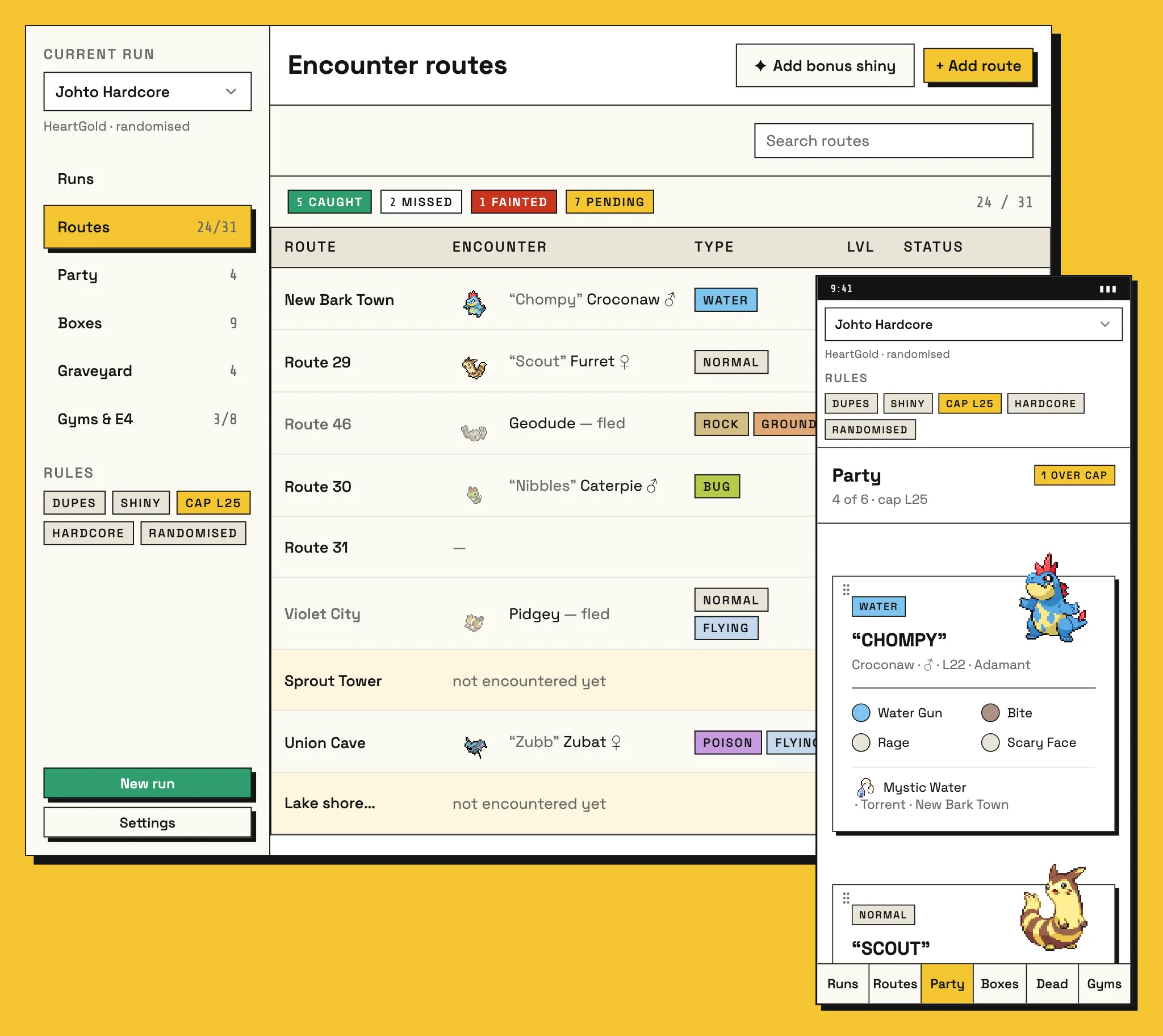
The Brief
A Nuzlocke is a challenge run of a Pokémon game with rules you set yourself. You can only catch the first Pokémon you meet on each route. You nickname everything you catch. If a mon faints, it’s dead, and it goes in the graveyard. The rules are simple, but keeping track of them over a thirty-hour run isn’t.
I’m building this for my own runs. I wanted something I could keep building and customising over time, with randomised runs, romhacks and challenge variants like Soul Link Nuzlockes on the list for later. Those are all future plans. The first version does one game, HeartGold, and does it well.
Two Ways to Play
Before drawing anything, I had to know where the tracker would be used. There are two setups I care about equally:
- Emulator on a desktop, with the tracker open on a second screen.
- A handheld on the couch or in bed, with a phone next to you.
Both mean the tracker is the thing you glance at between turns, not the thing you’re focused on. Logging an encounter has to be fast, and the route list has to tell you the state of your run at a glance. Those two screens got the most care.
Flows Before Style
I started by writing down the basic features I wanted, then gave that list to Claude Design to get some rough lo-fi mockups. It got me to a first draft quickly, but the draft needed a lot of work before I trusted it:
- It didn’t understand why some fields had to be certain data types. Species and moves, for example, need to be picked from a list, not typed as free text, because a typo in a species name breaks everything that depends on it.
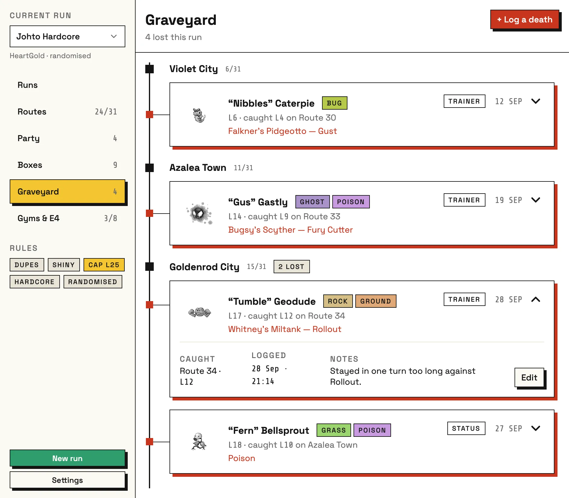
- It left things out for mons in different states. Its fainted mons dropped their type, moves and ability. But you still want to see all of that on a dead mon, whether you’re working out what went wrong or just remembering them.
- It used inconsistent patterns. One screen let you drag and drop to reorder, and another with a similar layout didn’t.
- It had layout and alignment bugs. I fixed a lot of these by hand, using the advanced design panel and editing the CSS directly.
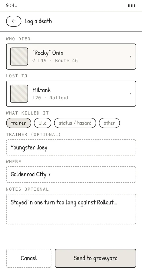
I kept changing the layouts until I was confident the core UX flows were right. The styling in these frames is deliberately rough: it’s a sketch, not a visual decision.
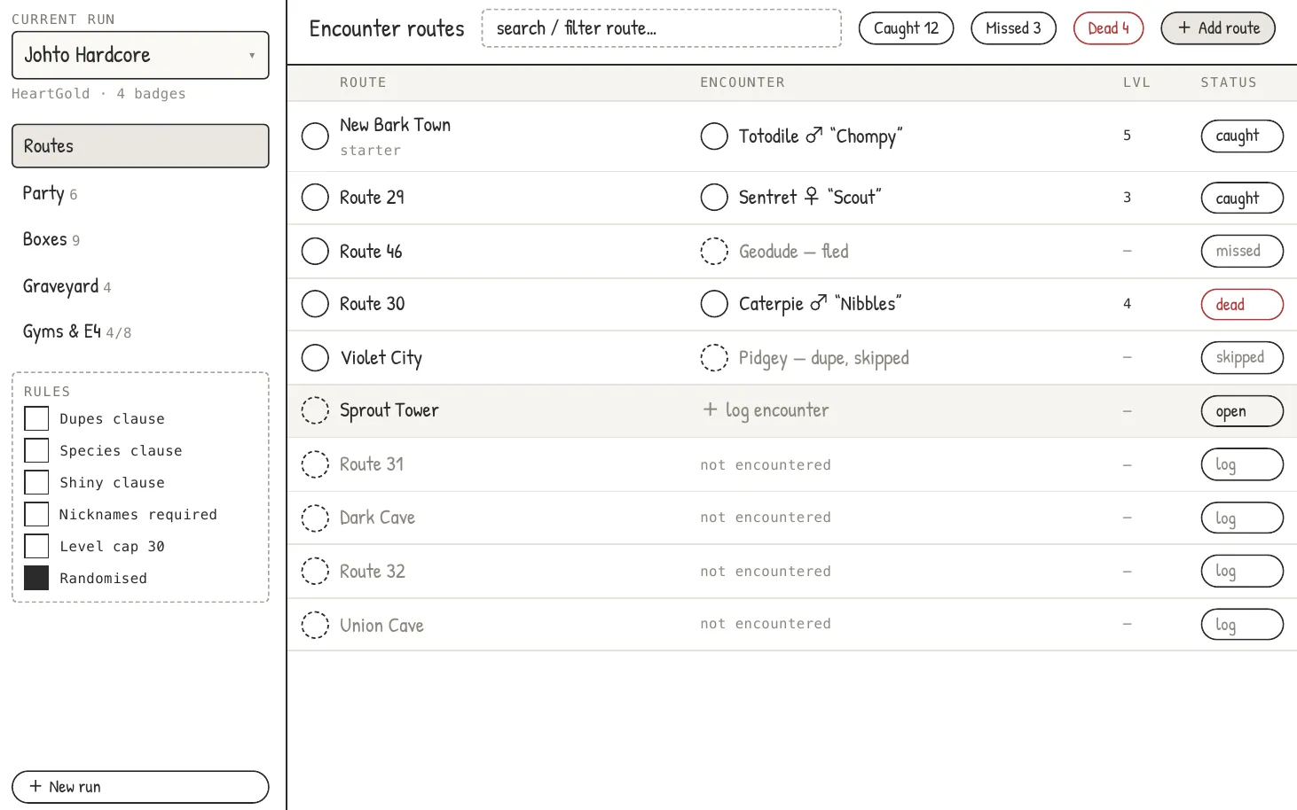
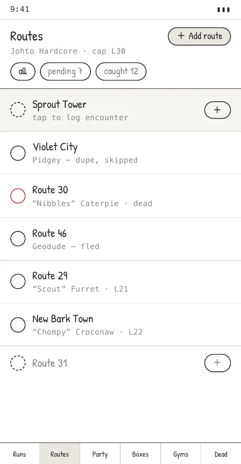
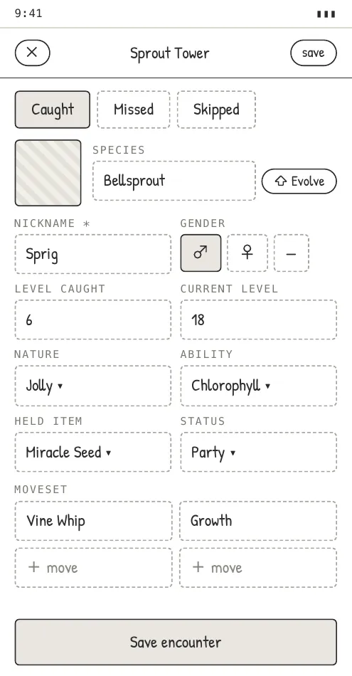
Three of the nine mobile screens I drew in lo-fi, all before any visual direction.
The Moodboard
Once the flows were settled, I went looking for visual inspiration. The notes on the board are the ones I wrote at the time.
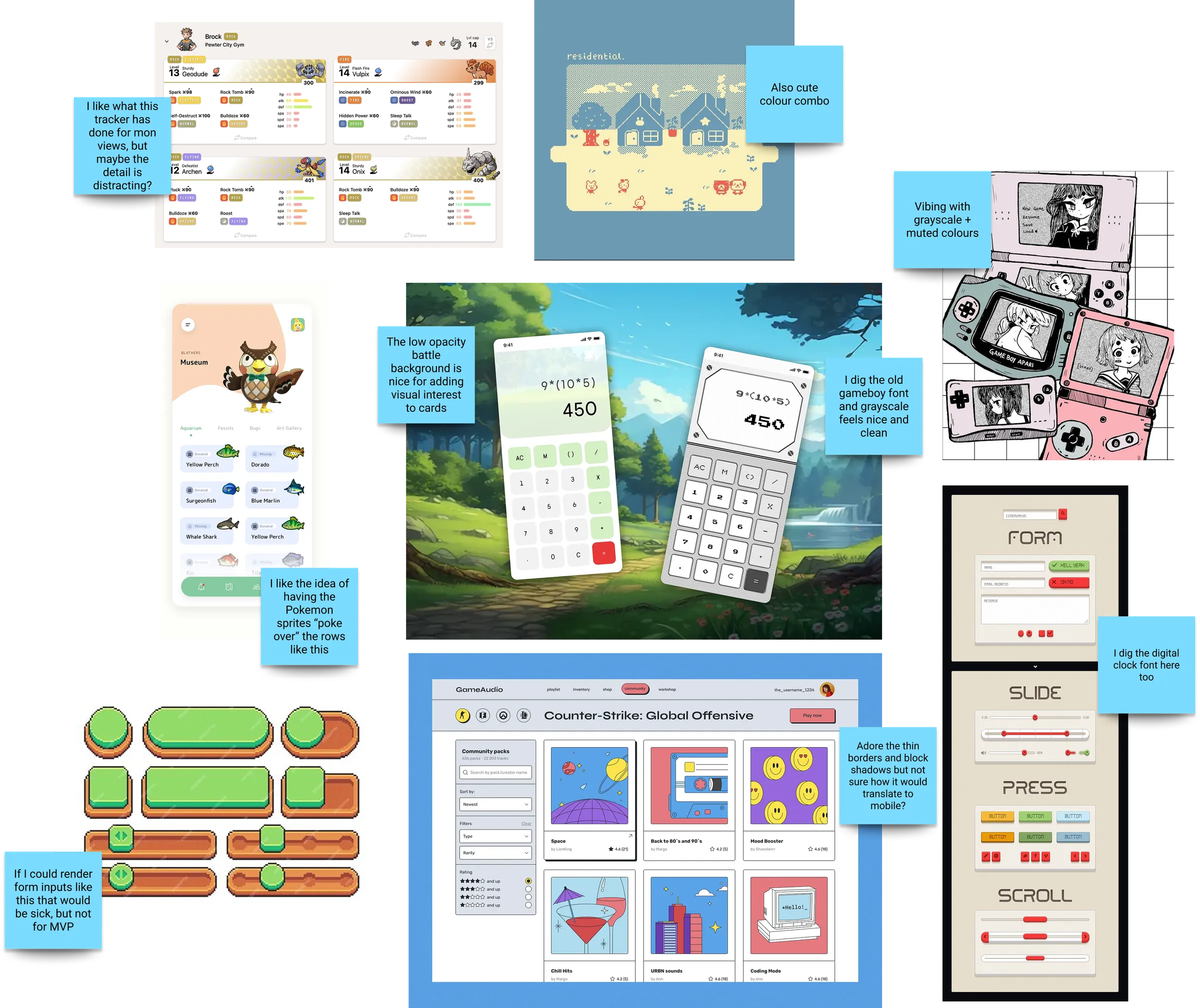
A few questions came out of it that I’d have to answer later. Was the existing tracker’s detail distracting? How would thin borders and block shadows work on mobile? And the pixel-art form inputs would be sick, but not for the MVP.
Four Directions, One Pick
I drafted four visual directions from the board. Each one comes from a different part of it.
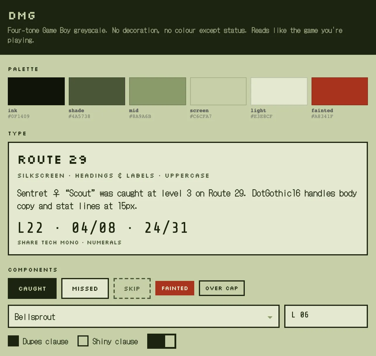
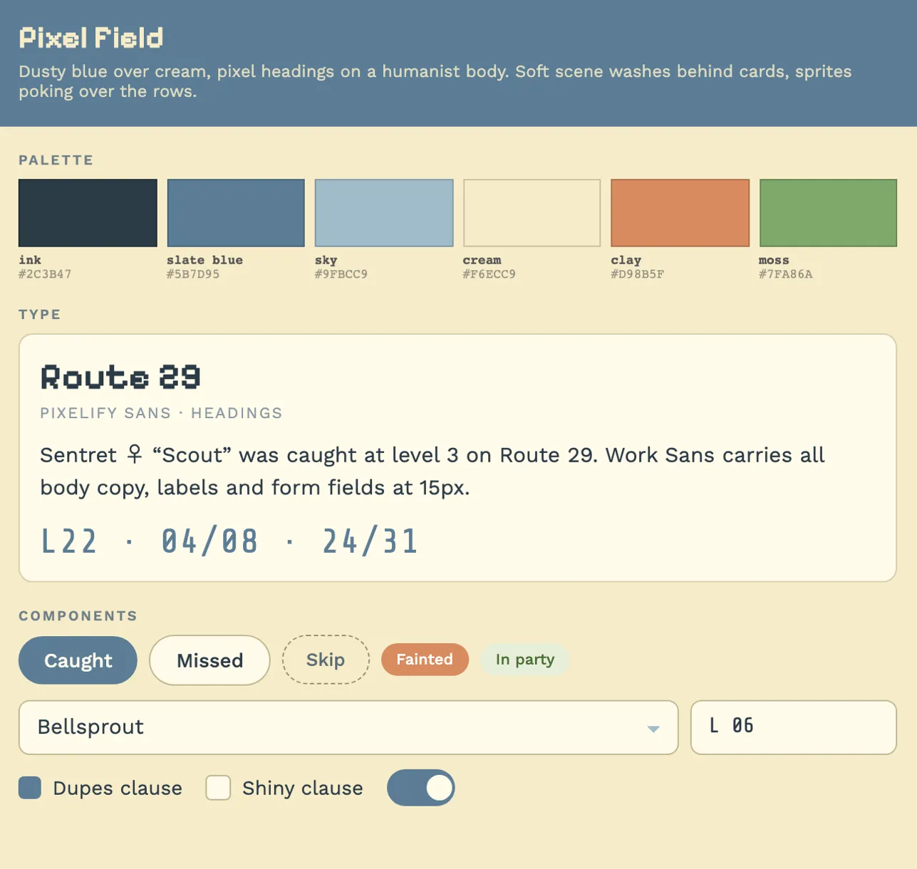
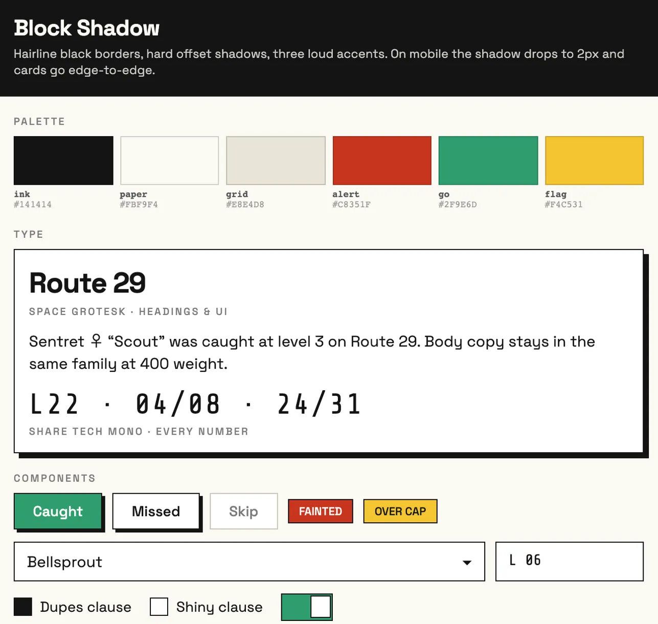
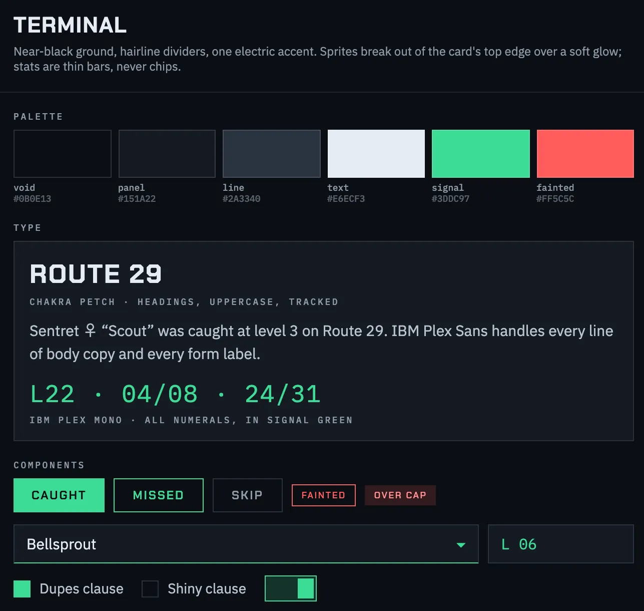
I went with Block Shadow. It was the one I liked most, but the bigger reason was contrast. I wanted the tracker to be as readable and clear as possible, and black hairlines on off-white with three strong accent colours give you that.
That meant moving away from the retro feel of the moodboard, which was on purpose. Pixel fonts are fun, but not when you’re checking your level cap mid-fight. I kept a bit of it: every number uses a mono font, Share Tech Mono, which is the digital clock idea from the board. It’s an accent, not the main typeface.
Hi-Fi
With the direction picked, I used Claude Design to apply it to the lo-fi screens. Then I did a lot more by hand, both tweaking the visuals directly and re-prompting to refine screens and check the flows still made sense.
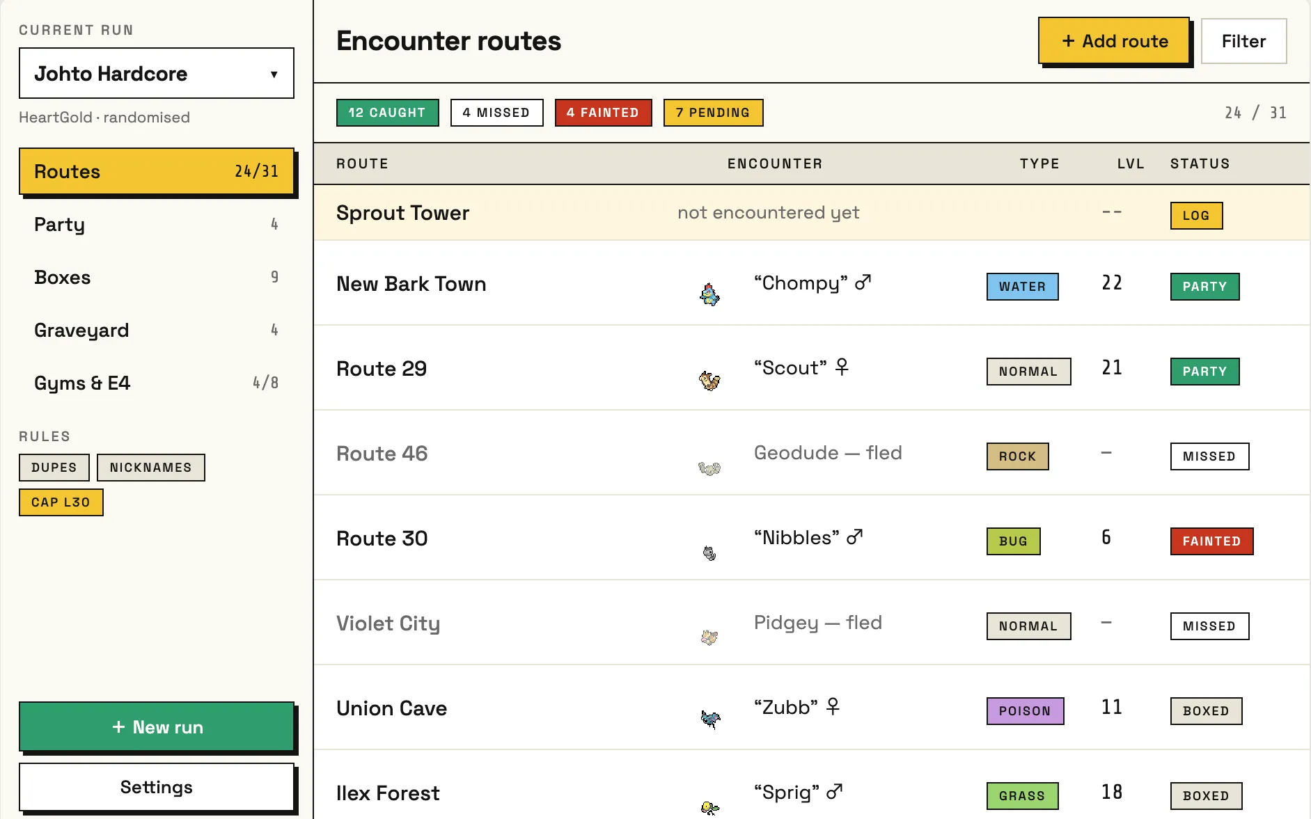
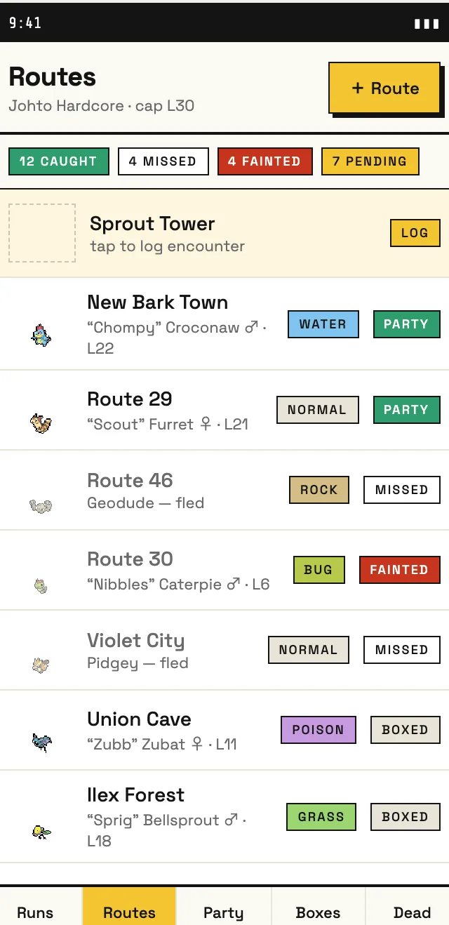
What changed from lo-fi to hi-fi:
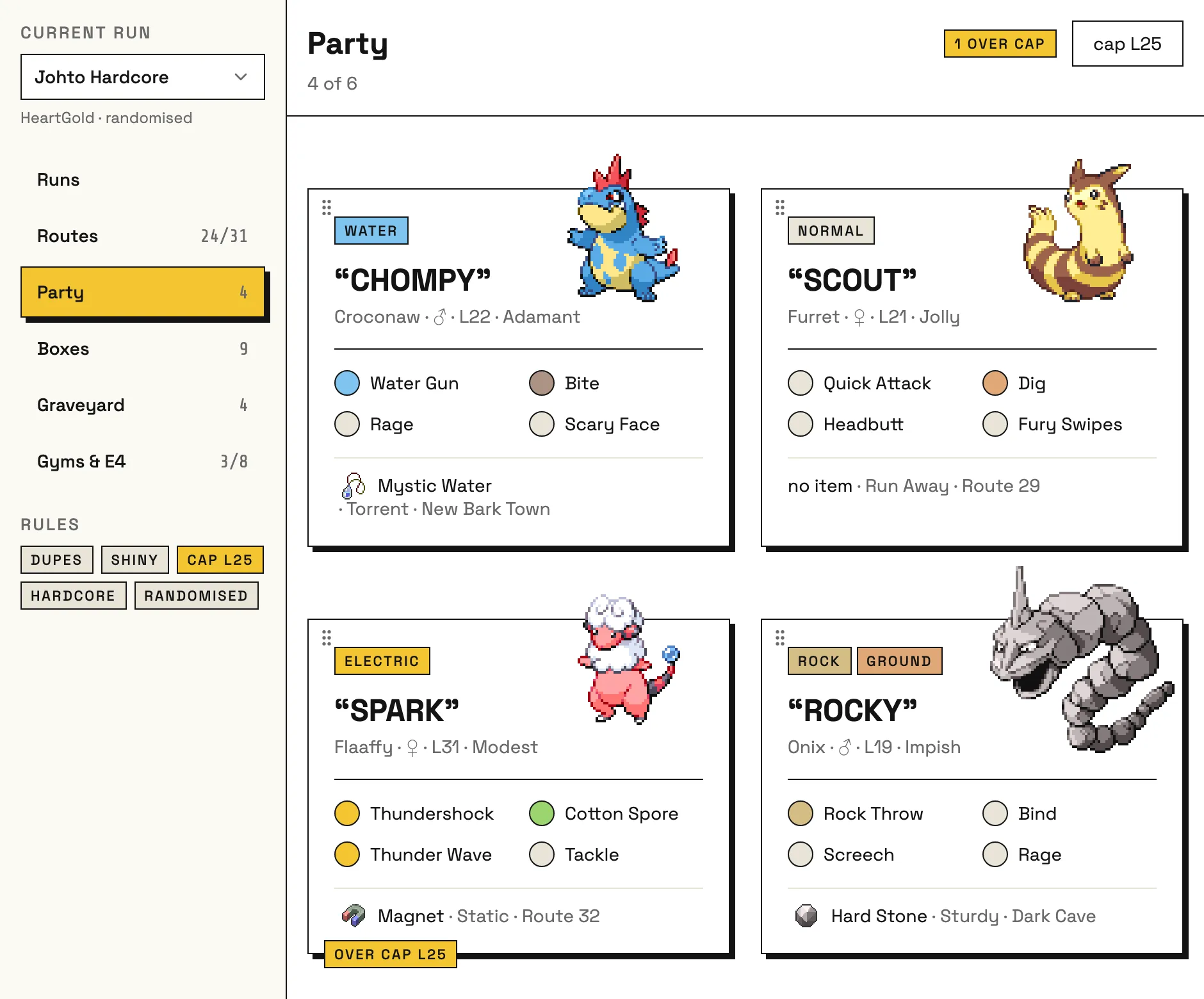
- Rounded pills became square chips, and every chip says its status in words, so colour is never the only clue.
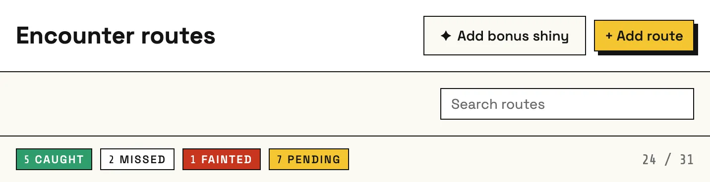
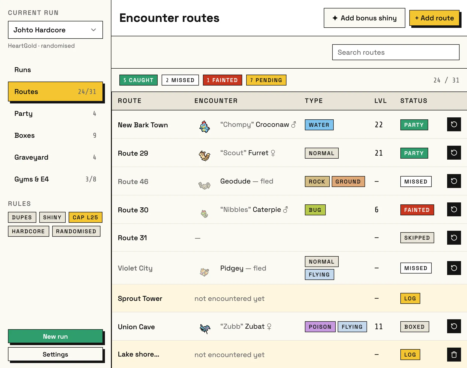
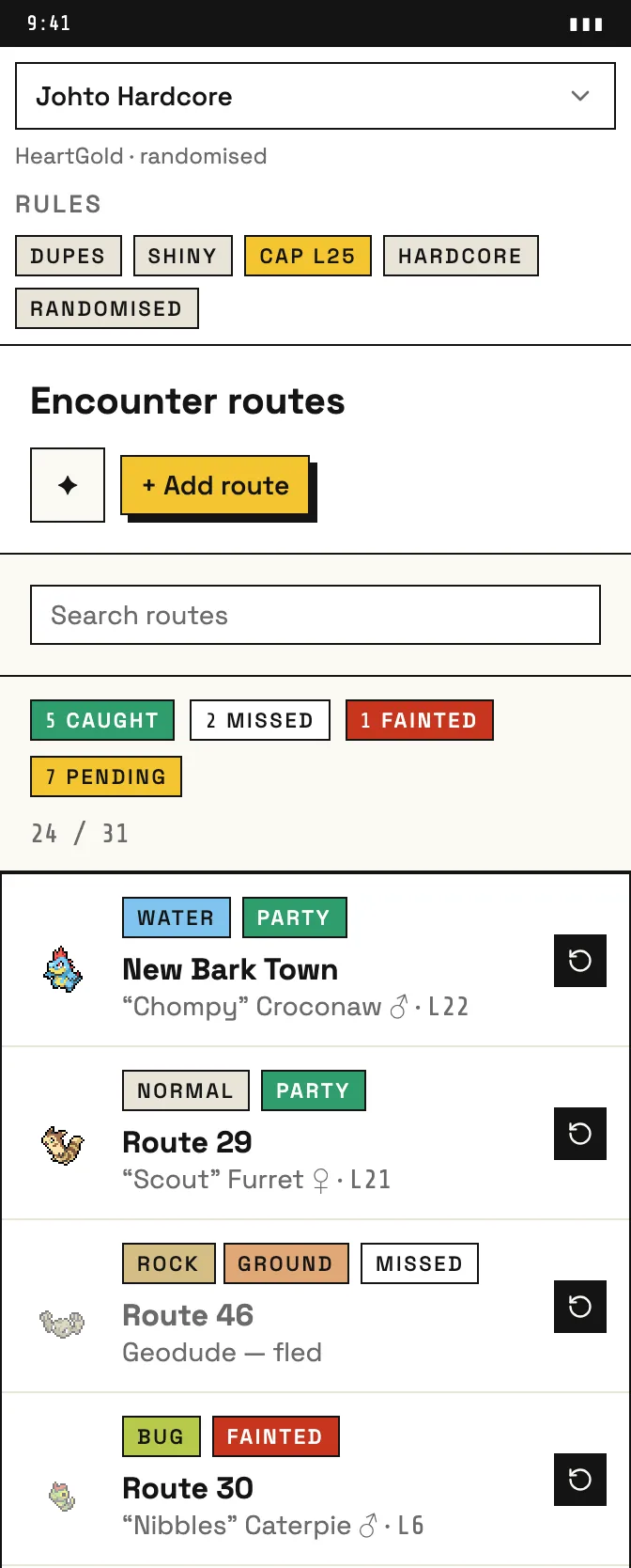
- A row of summary chips went at the top of the routes list, so you can see how the run’s going without counting rows.
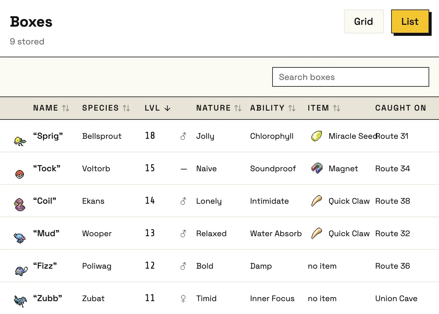
- A type column and sprites went into the table, so you can recognise each mon at a glance.
- Rules went from a checkbox list to chips. You set them once when you start a run, so after that they just need to be visible.
Some things got cut, too. I first wanted each mon’s six stats as bars, like the Terminal direction had. They’d have looked great, but people don’t min-max stats in a Nuzlocke. They care about what a mon knows, what it’s holding and whether it’s over the level cap, so that’s what the cards show.
Design to Code
A system you can’t skip
While I was still choosing a visual direction, I built the first screens on shadcn’s default theme so the two could happen side by side. Once Block Shadow was picked, I logged a separate set of tickets just for the design system and built it before touching any real screens. Then I moved the existing screens over to it one at a time, checking each on desktop and mobile.
I didn’t eyeball the palette, borders and shadows off a screenshot. I measured them from the canvas markup and wrote them down as tokens.
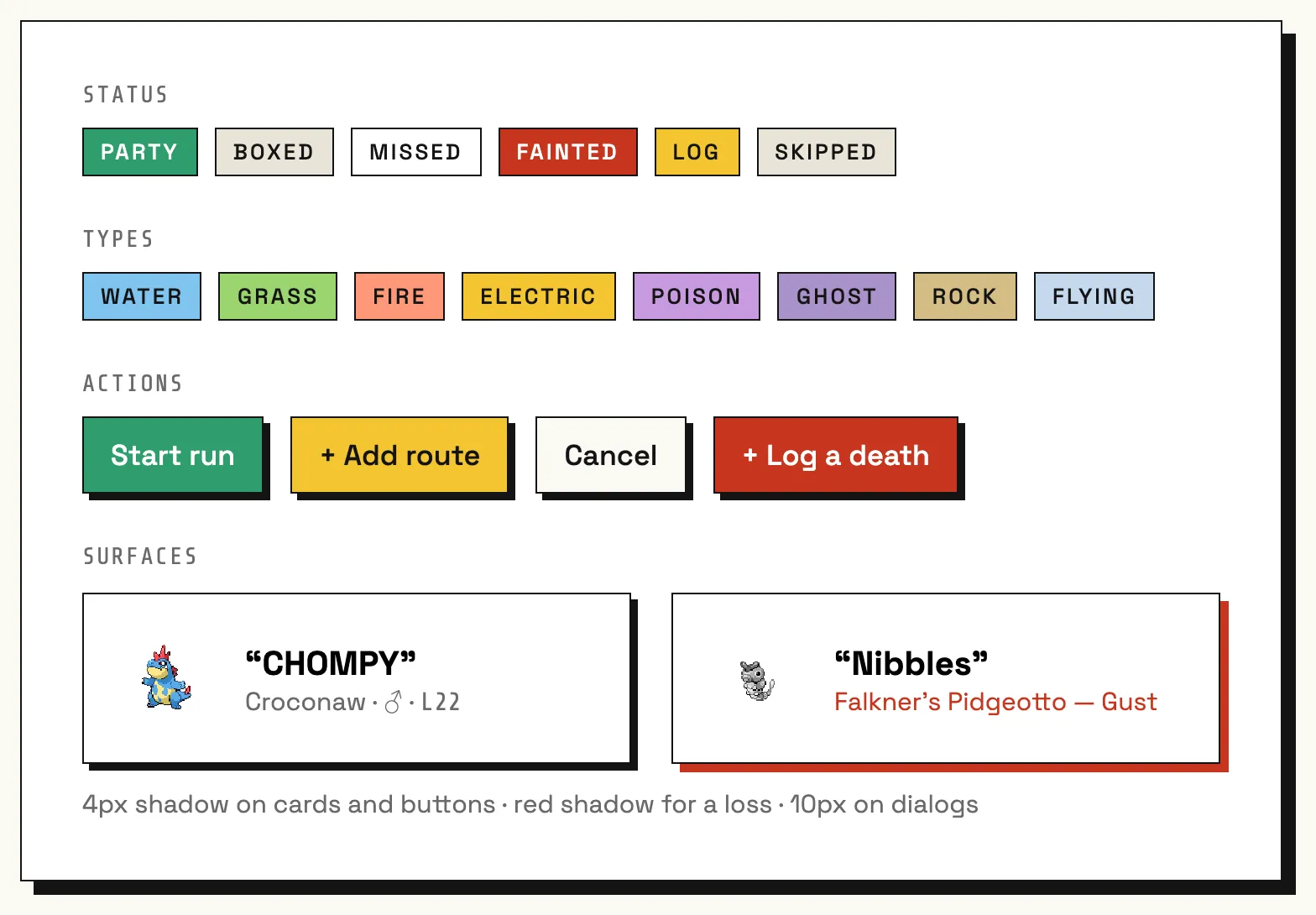
I audited the screens before adding any shared components, and started with only the ones that kept coming up: Typography, Surface and ScreenHeader. A lint rule bans raw headings, paragraphs and one-off text sizes in the app. I’d rather the components hold the styling. It’s also much easier to spot a raw tag in review than a class string that has drifted from all the others. The audit also showed spacing wasn’t consistent yet, so that’s next on the list to tidy up.
// Screens and the app shell can't style text by hand.
"no-restricted-syntax": [
  "error",
  {
    selector: "JSXOpeningElement[name.name=/^(h[1-6]|p)$/]",
    message: "Use <Typography> from @/components/typography for headings and paragraphs.",
  },
  {
    selector: "JSXAttribute[name.name='className'] Literal[value=/text-\\[/]",
    message: "Arbitrary text sizes are not allowed here. Use a <Typography> variant.",
  },
],
Where the design met the browser
- Desktop needed scaling up. The desktop frames are drawn on a 940px canvas, which looks tiny on a real monitor. From 768px up, the app sets the root font size to 125%, so type, controls and spacing all scale together. The 1.5px hairline borders don’t scale, because a hairline is a hairline and it’s what the whole direction is named after.
- Block shadows on mobile. On the moodboard I wasn’t sure how block shadows would work on mobile. The direction sheet said to drop them to 2px, but the drawn mobile screens kept 3px and looked right. I built to the screens.
- Filling in the type colours. The frames only drew the ten Pokémon types the mock data happened to use. I designed the other eight in the same colour family and checked that dark text passes WCAG AA on all eighteen. The lowest is 6.35:1.
- The number font. Every number is in Share Tech Mono, which is most of what makes the direction feel the way it does. But wrapping numbers in their own elements broke spacing inside flex containers:
12 CAUGHTlost its space andActive (1)gained two. Neither showed up in tests, so I only found them by looking at the screens in a browser. - The fonts are bundled and not loaded from Google Fonts. You might be mid-run on a phone with no signal, and the tracker should still look right.
The scaling is a few lines of CSS. The catch is that Tailwind’s breakpoints are in rem, so scaling the root would also move the mobile breakpoint from 768px to 960px. Pinning them in px keeps it where it should be:
@theme {
  --breakpoint-md: 768px; /* pinned in px, not rem */
}

@media (min-width: 768px) {
  html {
    font-size: 125%;
  }
}
Reviewing the AI’s work
Claude writes a lot of the code, and I review every pull request by running it myself on desktop and mobile. Often a feature works but the UX is wrong, and the fix is to make it simpler:
- Bonus shinies. With the shiny clause on, a shiny doesn’t use up a route’s encounter. Claude’s first version put a “Shiny” button on every route. I moved it to one “Add bonus shiny” button at the top of the routes screen, and named it so it’s clear what it’s for.
- Sorting and filtering. The first version had a separate sort dropdown and a filter menu. Now you sort by clicking a column header, which is the pattern people already know, and the status chips at the top of the list double as filters.
- Row actions. The whole row is the tap target for logging an encounter or opening a mon, with one icon button at the end to reset it. That’s far easier to hit on a phone than a row of small buttons.
Flexible, not “valid”
My usual instinct is to only let in valid data. Here I went the other way, because randomisers and romhacks can put anything anywhere.
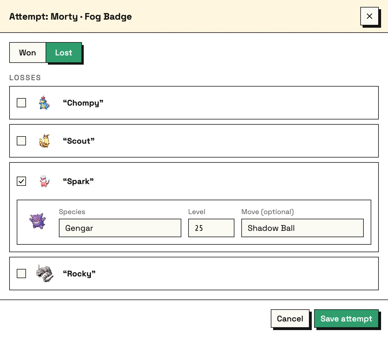
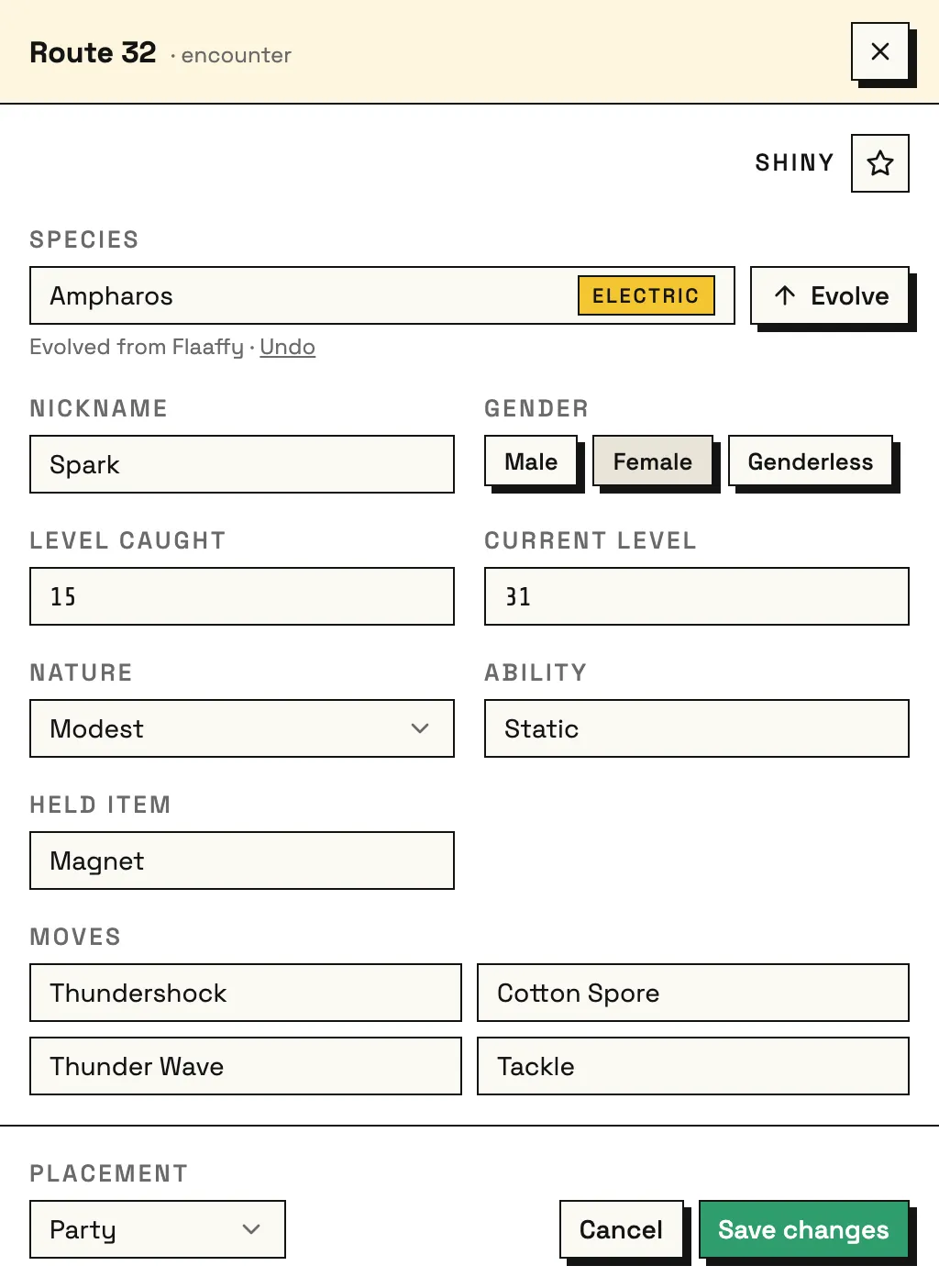
- Pickers show every generation, and a gym loss can be pinned on any species, not just the leader’s team.
- I don’t check moves against a mon’s real moveset. That would mean knowing which moves each Pokémon can learn in each game, and moves change between generations. It’s a lot of data to fetch and keep right, just to block players from logging what really happened.
- Picking, not typing. Species, moves, abilities and held items all come from lists, so you get the flexibility without typos.
- Types match the game you’re playing. Clefairy is Normal in HeartGold and Fairy in later games, and showing the modern type would be visibly wrong.
Leaving the data open ended up making the code a lot simpler.
Tested on purpose
Logic and components are covered by automated tests. Every time I add a guarantee, I break the code on purpose to watch its test fail, because a passing test that can’t fail proves nothing. In dev, a button loads a sample run with every case I care about, like shinies, deaths and very long names, and I test each change with a mouse and with only the keyboard.
One bug got through anyway: Pokémon with punctuation in their names, like Sirfetch’d, didn’t show up properly, and the move search had the same problem. PokéAPI’s names don’t match how players see or type them. I fixed the whole set with a mapping of special cases, then added them to the tests and the sample run so they can’t come back.
// PokéAPI ids can't hold the official spellings, so these are mapped by hand.
export const speciesDisplayNames = {
  "nidoran-f": "Nidoran♀",
  farfetchd: "Farfetch'd",
  "mr-mime": "Mr. Mime",
  "type-null": "Type: Null",
  sirfetchd: "Sirfetch'd",
  "deoxys-normal": "Deoxys", // a form id, shown by its species name
  // …
};
Designed to keep your run safe
The tracker is local-first. There’s no account and no server, and your run stays on your device. The catch is that iOS Safari can clear a site’s storage after seven days without a visit. For a permadeath tracker, losing a thirty-route run that way would be the one unforgivable bug, so JSON export and import was built in from the start as the backup.
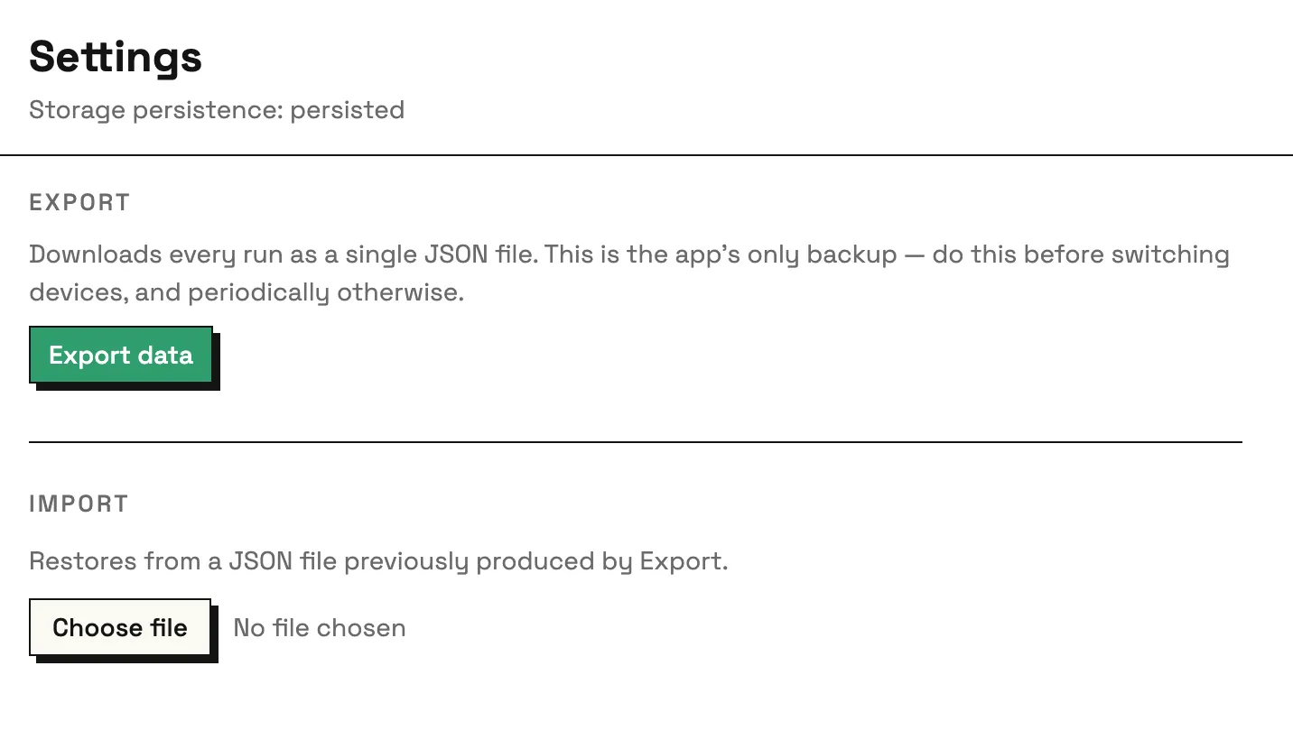
All storage goes through one adapter, and a lint rule stops anything else touching the database directly. When the app moves to a native mobile build with SQLite, only that one layer has to change.
Accessibility
Anything that uses colour also says what it means in words. Status chips and type badges always carry their label, so colourblind users aren’t relying on colour alone.
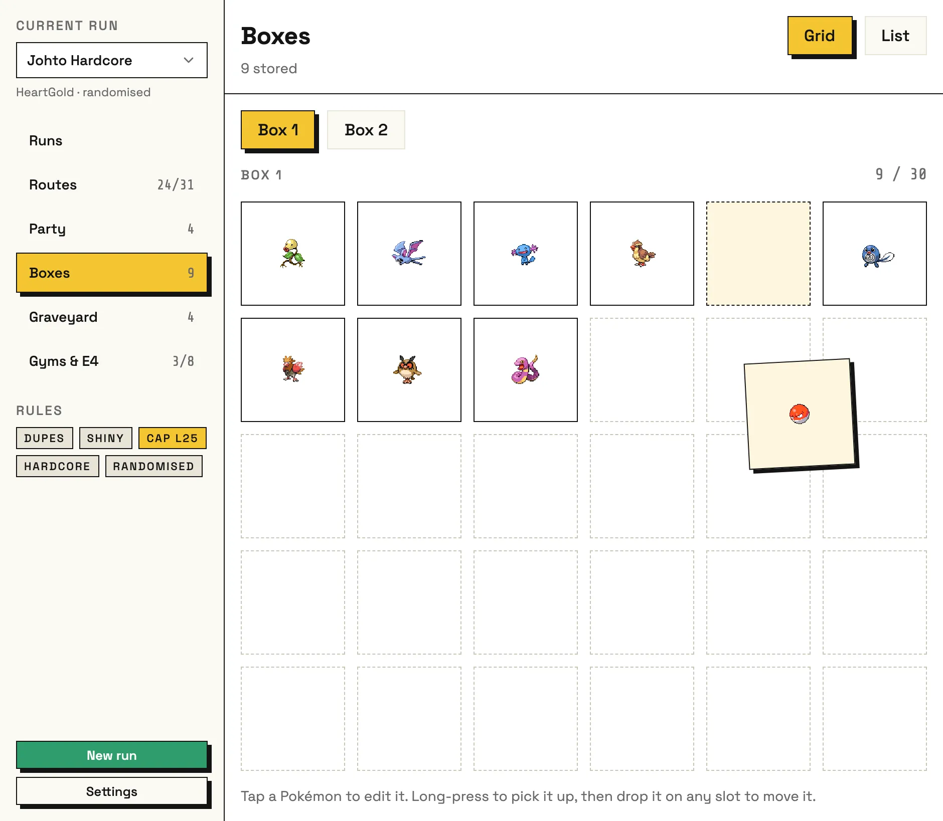
Every picker works fully by keyboard, and so does drag and drop for the party and boxes. Row buttons have names like “Open Route 29” so screen reader users know which row they’re on.
Keyboard use matters for everyone here: fast data entry gets players back to the game they’re actually playing.
As Built
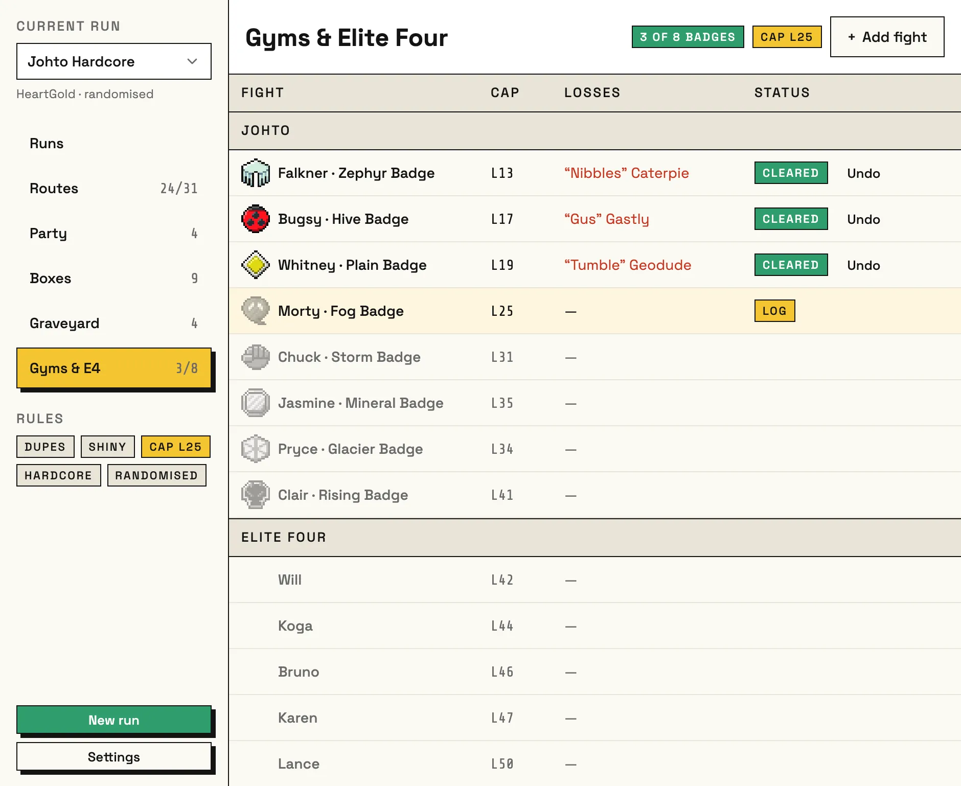
The core screens are built: routes, party, boxes, the graveyard and gyms.
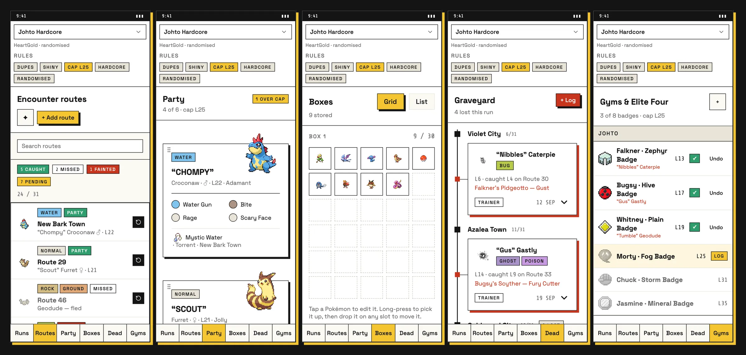
Closing the Loop
Once most screens were built, I synced the design file back to match the app. Building a feature for real shows edge cases and usability problems that a visual prototype can’t, and the code had moved on. Keeping both up to date also stops AI agents drifting from the design, and the sync caught visual bugs too, like text wrapping in odd places.
So it works as a loop. I try things in whichever medium suits the problem, then bring both back in line. The frames still win most of the time, because it’s quicker for me to tweak things visually and let that guide the code. The exception is when something built exactly to the design feels bad to use. Then I work it out in code, where I can try it for real in a browser and with a keyboard, and feed the result back into the design.
What’s Next
- Polish. Empty states, motion and press states, reduced-motion support, and a proper spacing scale.
- Trainer sprites for the gyms and fights.
- An installable mobile app via Capacitor, swapping in native SQLite behind the storage adapter.
- Romhacks, more randomiser support and Soul Link runs. That’s why I built this myself in the first place. For Soul Link, each player tracks on their own device for now, which is what most players already do. Later, opt-in syncing could let you log one encounter for both games at once, with local-first staying the default.
- Maybe, one day, those pixel-art form inputs from the moodboard.