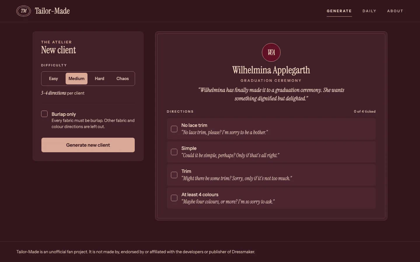
The Brief
Dressmaker is a game from Cozy Lives and Free Lives, released in September 2026. In the game, you run a dress shop, and story clients hand you a card of requirements, which you then design a dress to match. The off-rack dresses, the ones you can make for the shop floor to earn extra income, have no card at all - it’s essentially a sandbox mode where you can make anything you like.
Tailor-Made is designed to give you a handful of restrictions to work within, which can help give you a direction when you don’t know what to make. You get a client, a short brief and a few directions to design towards, all injected with personality to make it feel like you’re talking to an actual client. You can share a challenge as a link, or play the daily challenge, which refreshes every 24 hours.
Research
Dressmaker was a month old when I started, so there was no API and no data dump. I took my data from a fan wiki, dressmakerwiki.site, which was showing build 410 data. I checked its tag counts (tags are used in-game to describe materials, styles, etc) against a count I made myself, and read other guide sites to see that they described the same kind of card.
I catalogued all 77 story commission cards in a private note in order to get a sense of what the average commission shape was. A card can set a minimum, a ceiling, an avoid, an “only” list, a share or a count. Those patterns became the grammar for Tailor-Made’s own directions. The card text stays in that private note and nowhere in the app or on this page, since it’s the game’s IP - everything you see here was created by myself as original content.
The game gets patched often, so I checked build 443, the latest one with any evidence, before freezing the first data set. It added new fabrics and accessories, but no new fabric type, accessory type, style tag or colour, so I kept the data at the level of fabric types. There are 8 of them, against hundreds of individual fabrics. With how fabrics are categorised, the generator that says “Lace” or “No Silk” doesn’t go stale every time a patch adds a print.
Dropping the Numbers
The first spec the AI wrote copied the commission cards. A challenge had tag scores, a Quality target, a budget cap and percentages like “at least 40% velvet”. However, having played the game for upwards of 15 hours at this point, I knew those numbers don’t show up on an off-rack dress. You can’t see a tag score or a running cost, so a player could never check a challenge like that.
I rewrote the scope before beginning to even think about the generator code to ensure we had the problem in the right shape before wasting valuable development time. The new rule is that every direction must be something you can judge by eye. That means a style, a fabric, a colour to use or avoid, an accessory to add or avoid, or a small count you can tally. Trim lengths went away too, since nobody measures those on screen.
The examples below are invented, not taken from the game. The right column shows the kind of direction that replaced the numeric properties, against what we had in the initial spec direction.
| A numeric value | The kind of direction that replaced it |
|---|---|
| Keep the cost under a set budget | No Silk |
| At least 40% velvet | Velvet |
| A minimum score in the Gothic tag | Gothic |
| A set length of trim | At least 5 bows |
The spec also had a cut line, so scope couldn’t shift as I started working. If briefs and difficulty together turned out to be too much, I’d keep the briefs and drop the difficulty dial (I never needed this, but it helped to have this written down before I started).
Flows Before Style
I drew 26 screens and states, each at desktop (1440px) and mobile (390px), as lo-fi frames in Claude Design. That covers the empty generator, every difficulty, a card with some directions ticked, rerolls, the share link, a bad link, the daily page and the About page. This stage was about making sure I was capturing the core user flow and all of the information a player would need was accessible somewhere in the app, in an appropriate information architecture.
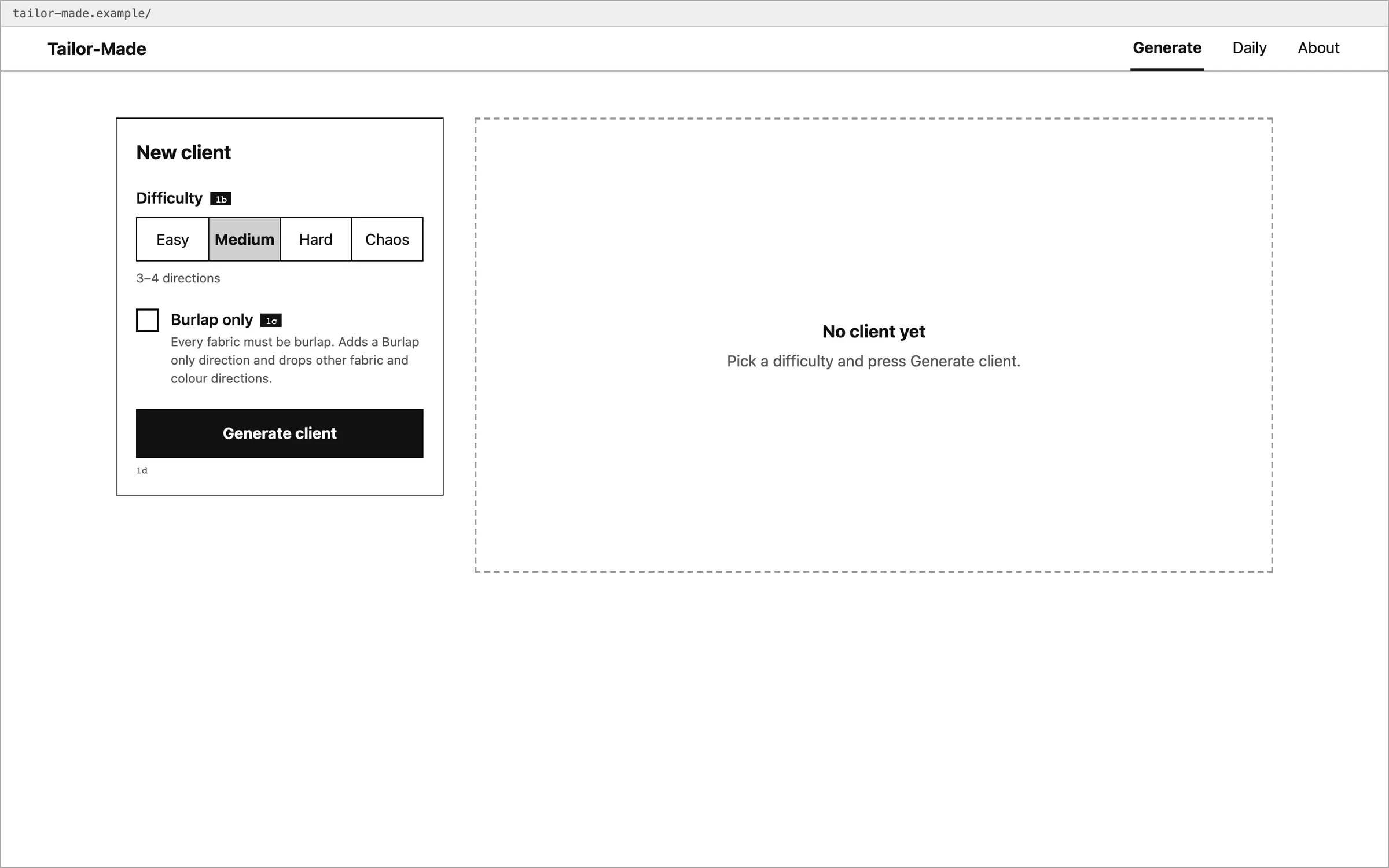
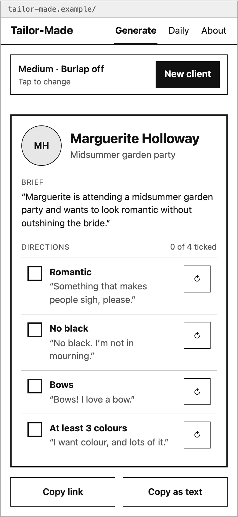
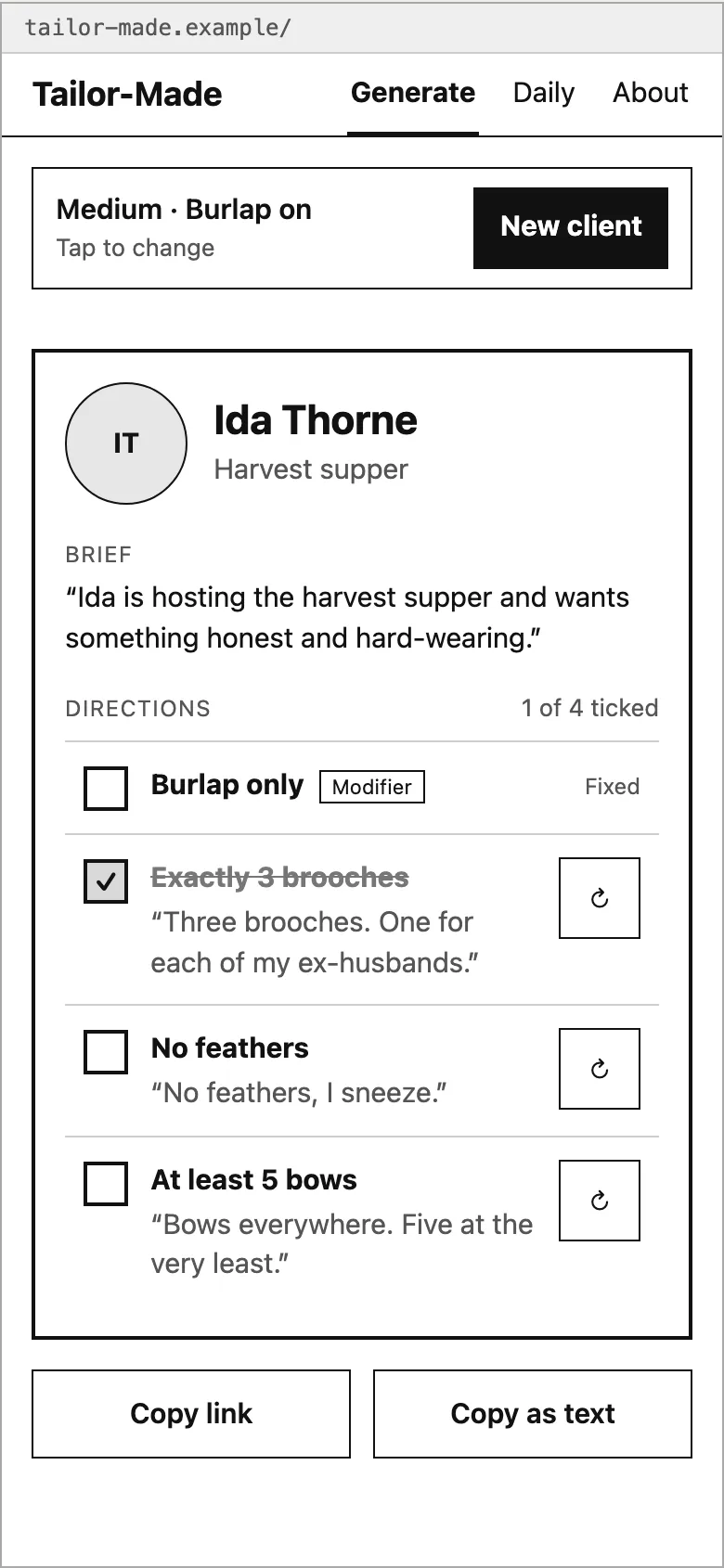
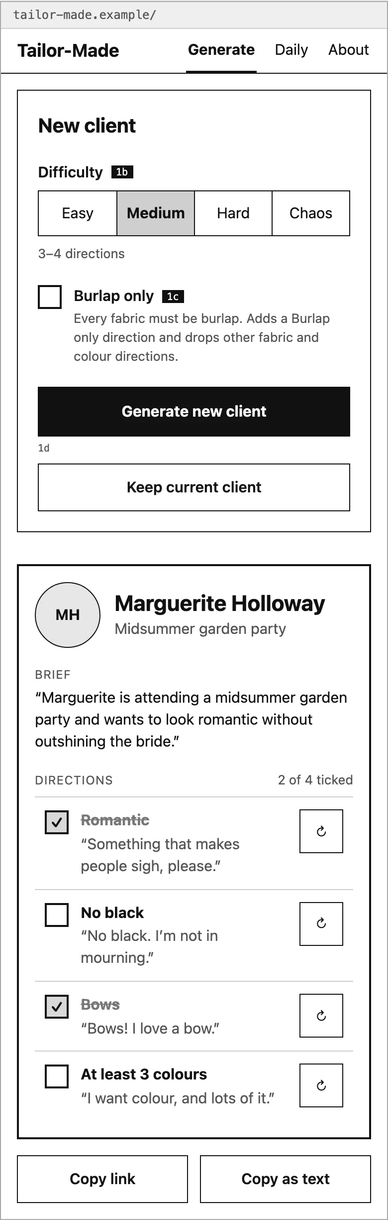
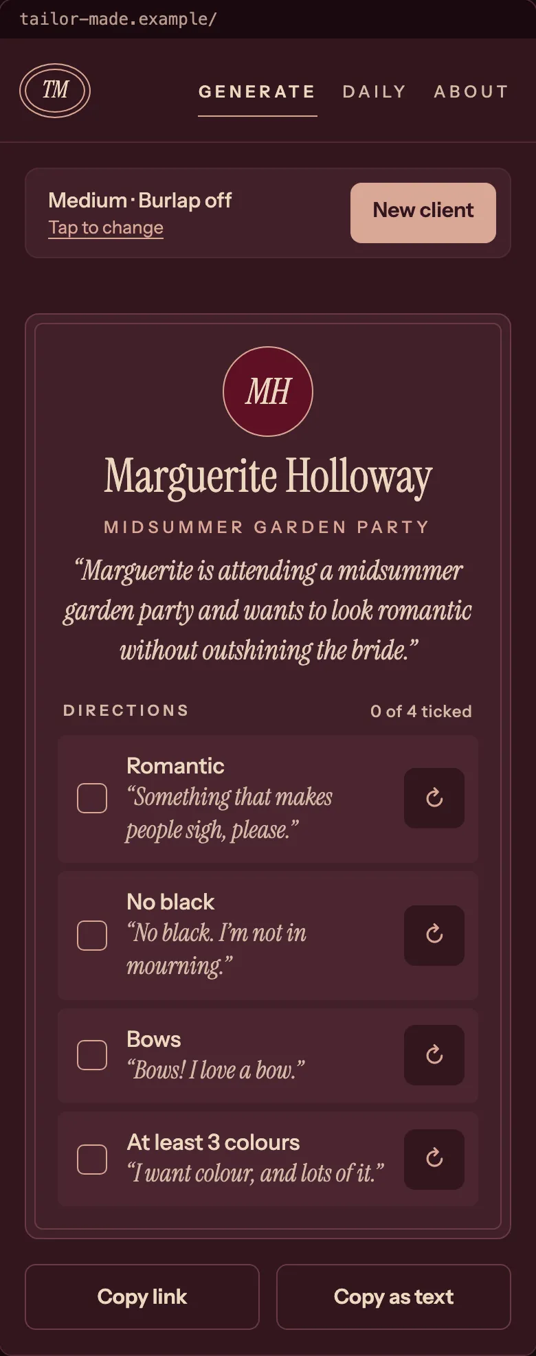
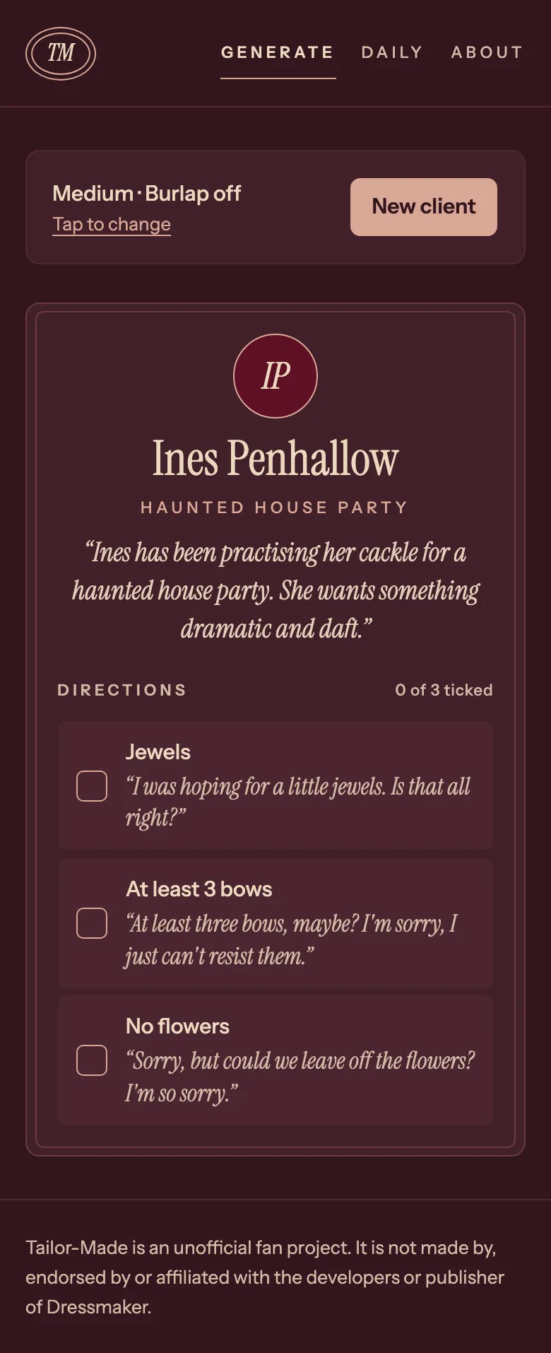
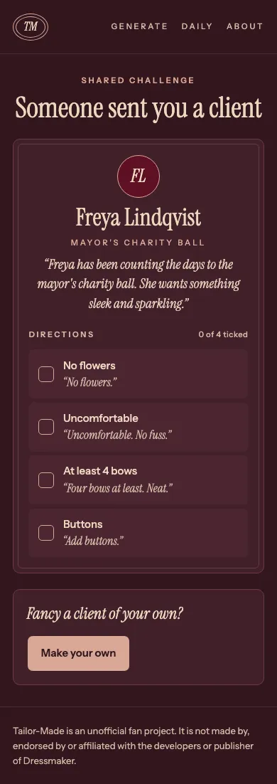
Desktop and mobile get the same attention. On a phone the controls fold away into a summary row, so the card stays the first thing you see.
Four Directions, One Pick
Normally my design process for visual direction starts with me creating a mood board of various visual inspirations that fit the vibe I’m going for. In this case I didn’t need it, because I already had the palette and the atelier feel in my head: warm, dark and a bit old-fashioned, like a sewing room. So I noted the shades and font styles I had in mind, then asked Claude Design to flesh it out by exploring four different visual directions. Each one shows a wordmark, a palette, type and the same client card.
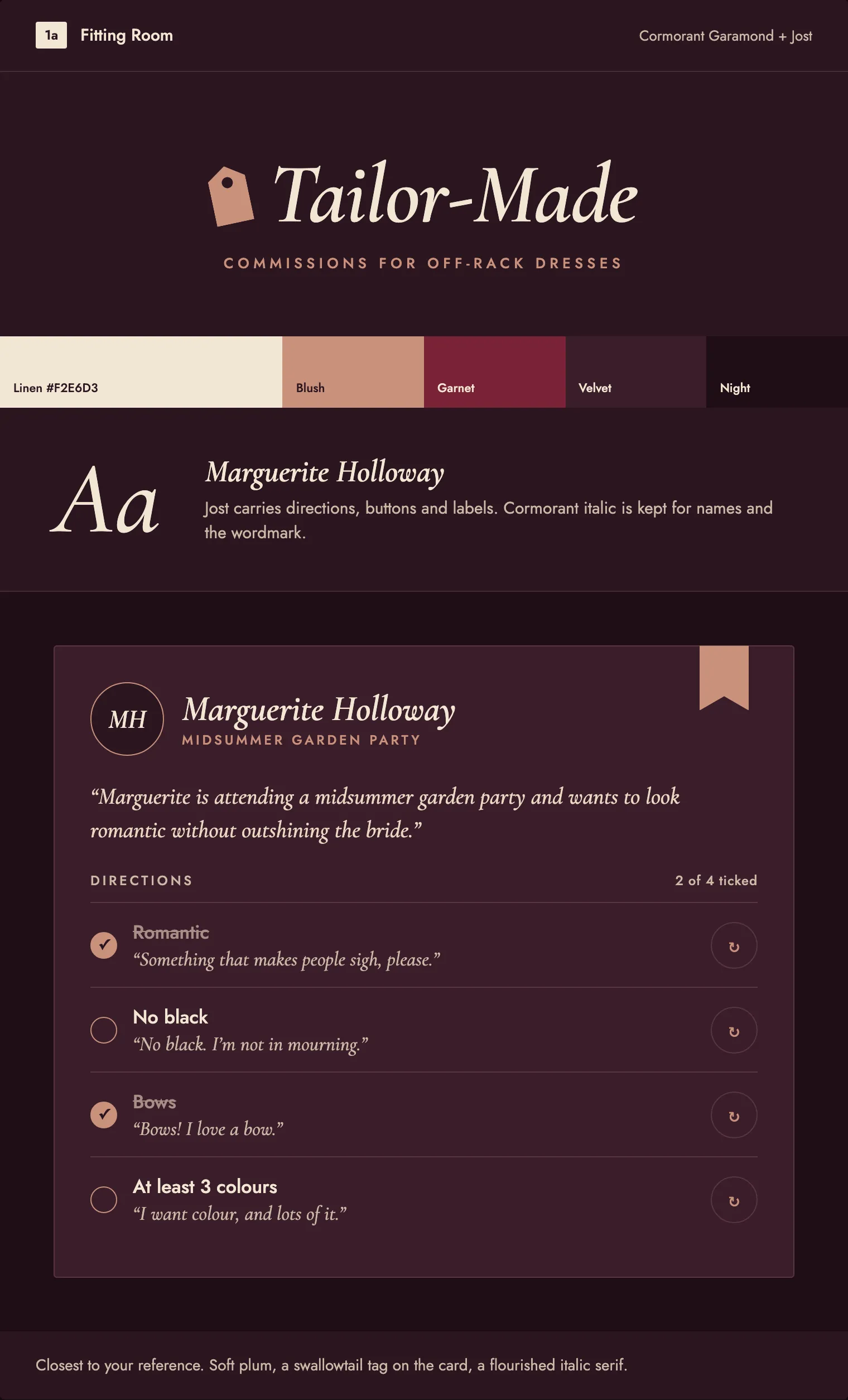
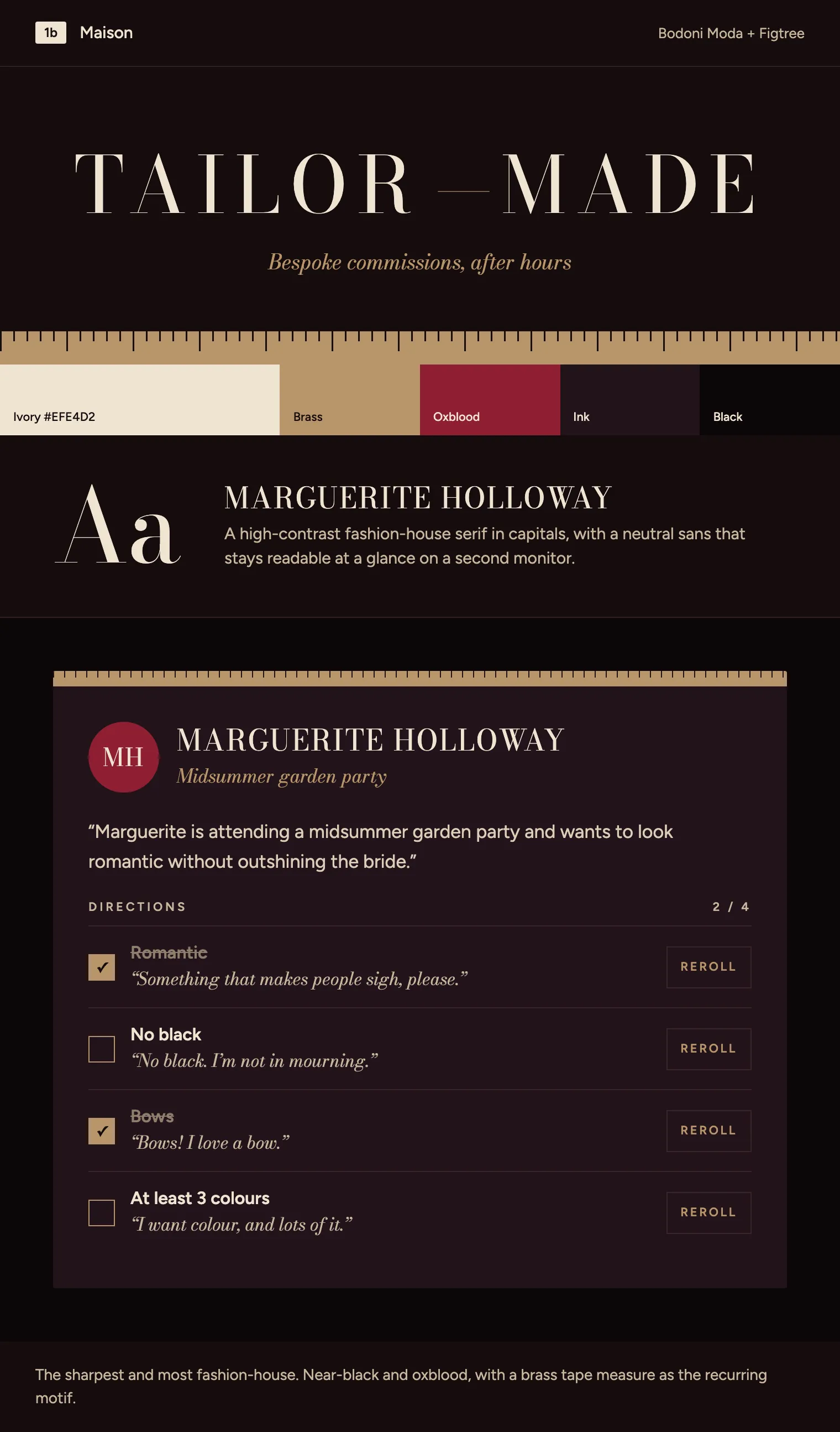
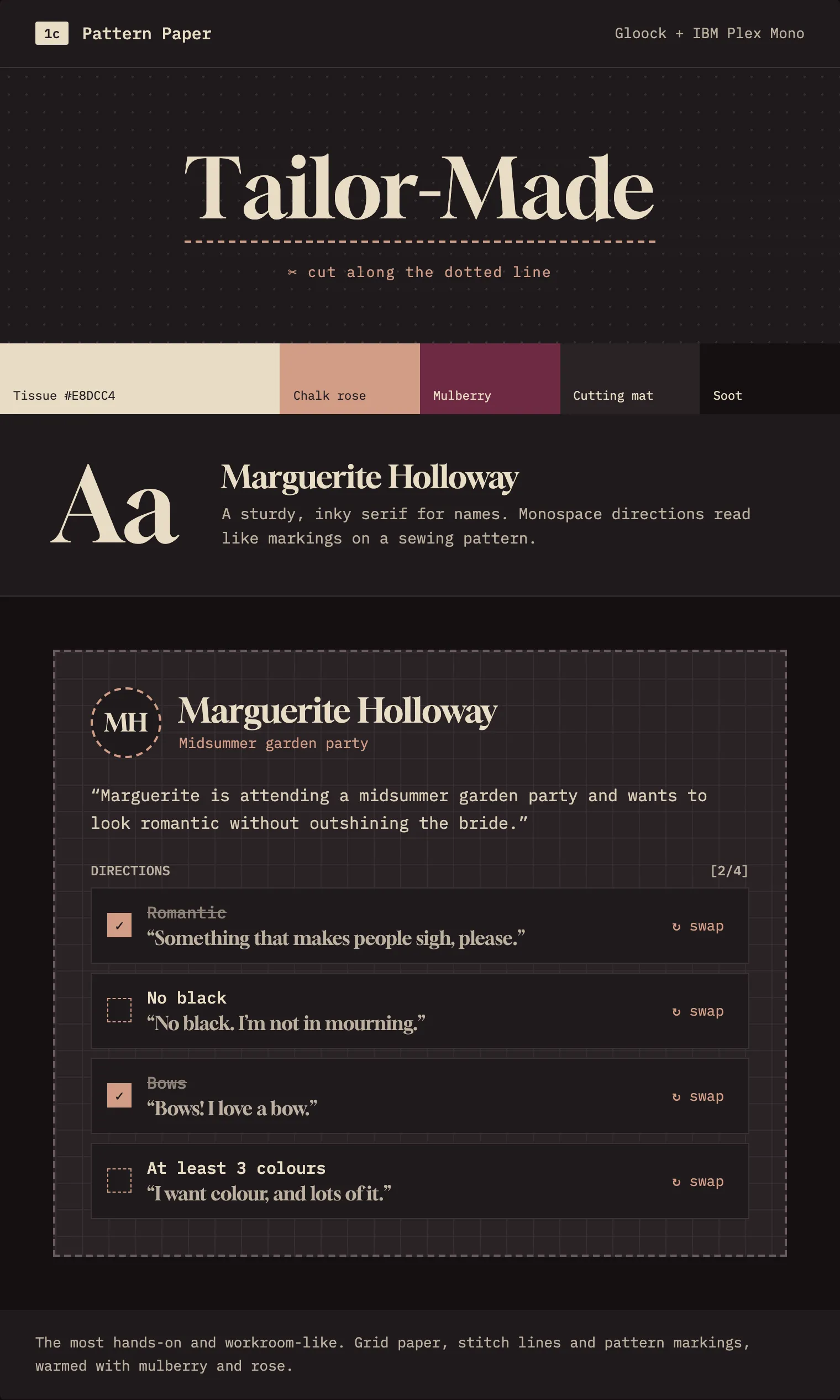
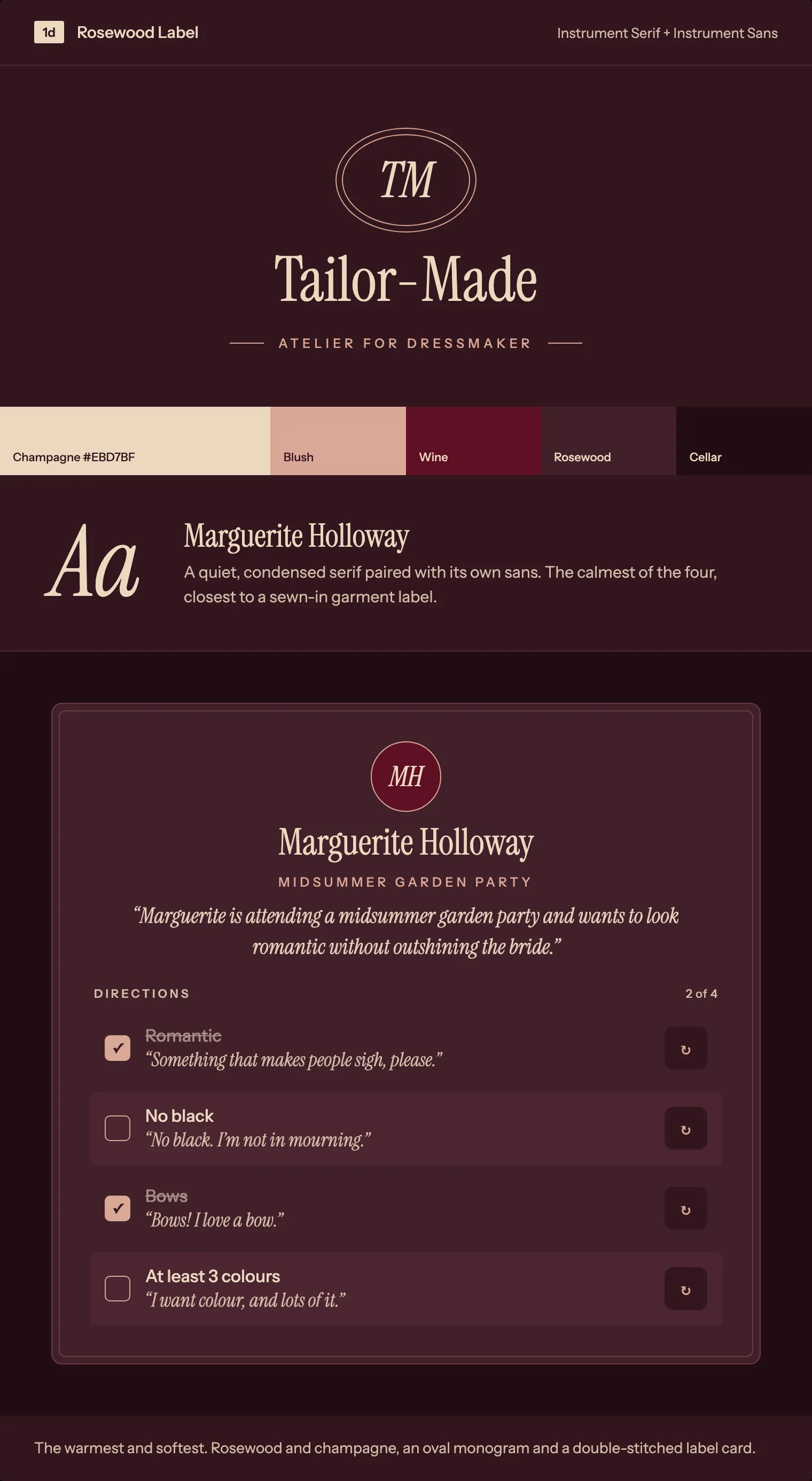
I picked Rosewood Label, since it felt warm and cosy, the way the game does, and was the closest to my original vision. The other three were far too high-fashion for the people who play it. I wanted it to feel less like Chanel, and more like a local independent boutique. This is something I’ve learned is very important as more and more people use automation to figure out visual design - you have to remember that the audience you’re designing for might respond differently to the direction that you personally like the best.
The canvas calls it Rosewood Label, but in the repo I decided to formalise it as Rosewood Atelier.
Hi-Fi
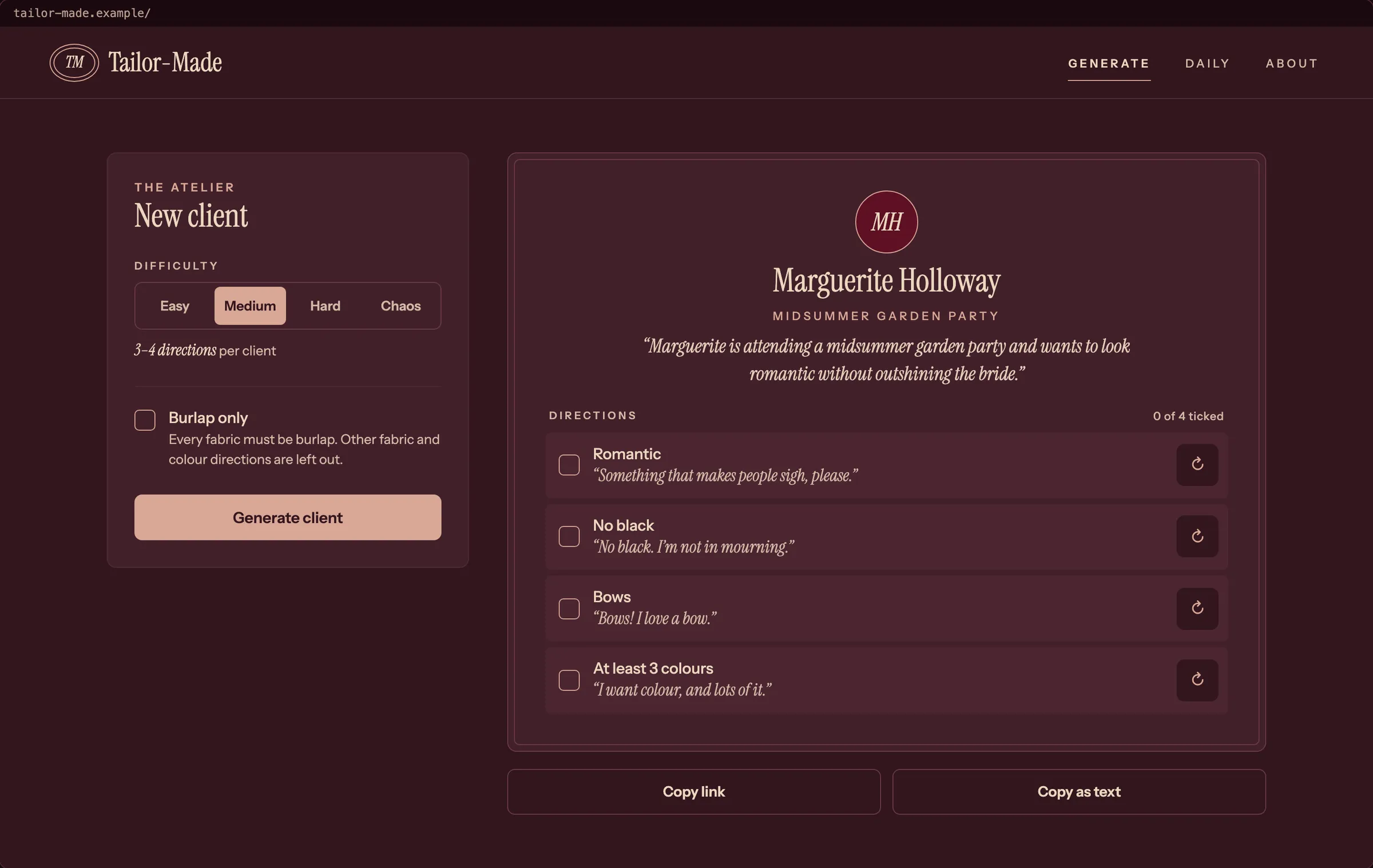
I had Claude Design redraw all 26 frames in Rosewood Atelier, then I refined them. There’s a relatively simple set of guidelines for this due to the simplicity of the app itself - it’s dark only, with no shadows, and one dusty rose accent carries every button, tick and link. Once I was happy with how things were looking, I then set up the app to capture the selected visual directions in theme variables and reusable components, so that we were building consistently from the very start.
Decisions win over frames
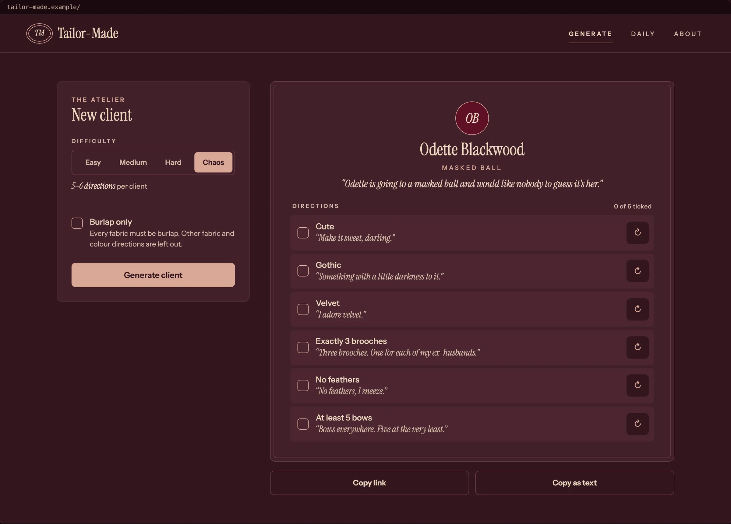
The hi-fi frames aren’t always right by the time the project is fully built. I find that as I build and test in an actual browser, some things that felt right during the design phase don’t work in practice, so iteration is inevitable. The README for the frames lists where they’re wrong, so Claude Code built under my decisions and guidance rather than just relying on the wireframes. The clearest example of this is Chaos difficulty. The frame below draws a reroll button on every direction of a six-direction Chaos card, but rerolls on something designed to be deliberately challenging felt like it was defeating the point.
Planning the Build
Before any code, Claude drafted a spec, which I then reviewed and refined, and I rewrote its scope. Claude then drafted the Linear tickets from the spec. I reordered them, edited them and set the priorities. The tickets are titled in build order, with blocking links, and each one names the wireframe frames it builds to, so when an agent picks up a ticket, it knows what to build and what it should look like. I find that blocking links are especially important in this workflow so that priorities and ordering are clear, and we don’t end up with half a ticket done in a PR due to a blocker, then having it forgotten down the road.
The agents work under a CLAUDE.md file I set up and kept current. The generator stays pure, share links rebuild forever, layering runs one way and lint enforces it, and desktop and mobile are equals. These are the five hard rules:
1. `src/domain` is pure. No I/O, no `Math.random`, no `Date`. Randomness and time come in as
   inputs. Lint enforces it.
2. Data and brief versions are frozen once published. Any change, including a game update that
   adds content, goes in a new `vN.ts`. Never edit `v1.ts` after it ships (spec section 4).
3. Share links rebuild forever. A link names its data version. The PRNG (cyrb128 seeding sfc32,
   with 15 warm-up draws) never changes for a published version.
4. Layering runs one way: `features → links → domain → game`. `no-restricted-imports` in
   `eslint.config.js` enforces it. Do not lift a rule to get around it. Move the code.
5. Desktop and mobile are equals. Design, build and test both. Playwright runs both projects.
The work runs on one ticket, one PR, and I merge. I asked for PRs under 500 changed lines, with 1,000 as a hard limit. Each one is written in plain English, for someone who isn’t an engineer, with a “How to check it” checklist. That checklist is what I work from when I test.
When tickets depended on each other, I ran small stacks of two or three PRs. I tested each one by hand and passed my feedback straight back to the agents. In all, it came to 47 PRs in a week (16 to 23 October 2026), from an empty scaffold to a site deployed on Netlify from CI.
Design to Code
Claude Code wrote most of the code, and I merged every PR. These are the places where I stepped in and the AI wasn’t going to get there alone.
Calls I Made While Building
- Chaos can’t be rerolled. Chaos is the hardest difficulty. If you can reroll away the awkward directions, it stops being hard. I decided it wouldn’t allow rerolls, and wrote it into CLAUDE.md as a decision. A Chaos link with a reroll history is treated as invalid.
- Say it once. The generator was dealing two directions of the same kind, so a card said “No cotton” in one row and “No velvet” in the next. I wanted a client to talk the way a person does. PR #41 merges them: “No cotton or velvet”, or “Red and blue”. A card never has two directions of the same kind. It was an 870-line PR, well over my 500-line aim, and I accepted that, because splitting it would have left
mainhalf converted. - Proving the accessibility check works. The tests ran an accessibility scanner (axe), but a check that has never failed proves nothing. So I had a throwaway PR (#39) add an image with no alt text to the daily page. CI went red, which is what I wanted to see. I closed that PR and deleted the branch. The coverage went in with PR #40.
Tested on Purpose
A green test suite only proves the tests agree with the code. So I asked for each guarantee to be broken on purpose, one at a time, and for the suite to be run each time. If a test stays green, it’s a fake. The results are in the repo, and these are five of the ten:
| Guarantee | The break | Test that caught it |
|---|---|---|
| No contradictions or repeats | The conflict check is skipped when a direction is drawn | Property: never contradict themselves or repeat a direction |
| Counts stay in range | The largest count is widened from 8 to 12 | Property: keep counts in range and count only per-piece accessories |
| Chaos has exactly one opposing pair | The Chaos pair is never placed | Property: give Chaos exactly one opposing pair |
| A link rebuilds the same rerolls in order | The reroll history is sorted before it is replayed | Property: rebuild from the seed and the history to the same challenge |
| Old share links keep their text | One character changed in a client line | Pinned challenges: still rebuilds every pinned challenge exactly |
The property tests run thousands of random challenges. A pinned set of 110 challenges guards old share links, so a change that would break a link someone already shared turns the suite red.
One probe first stayed green. The count test checked counts against the code’s own range constant, so when I widened the constant, the check widened with it, and it could never fail. The test now uses the literal numbers from the design, and the same probe turns it red.
Share links last because a link holds the seed and the reroll history. The generator is seeded and pure, and each data version is frozen once published, so the same link rebuilds the same card, however the app changes after that.
Giving Clients a Voice
This was the trickiest place to step in. Every seed makes a different card, so there’s no fixed page of text to proofread. The AI wrote the first lines, and I had to find a way to review text that’s incredibly dynamic.
Voices. Each client gets one of six personalities from the seed: Deadpan, Gushing, Brisk, Grand, Anxious and Theatrical. Each has its own line for every kind of direction. The tables below show the same direction in each voice. I read every line before merging PR #15 (the first three voices) and PR #19 (the other three).
| Direction | Deadpan | Gushing | Brisk |
|---|---|---|---|
| Gothic | “Gothic. Think funeral, but fun.” | “Oh, something gothic, darling! Dark and dreamy.” | “Gothic. Nothing flimsy.” |
| No wool | “Not wool. It knows what it did.” | “I’m afraid wool and I don’t get along, dear.” | “Skip the wool. Thanks.” |
| At least 5 bows | “Bows everywhere. At the very least, five.” | “Five bows at least, dear! I can’t have too many.” | “At least five bows.” |
| Direction | Grand | Anxious | Theatrical |
|---|---|---|---|
| Gothic | “Gothic. My family has always dressed for a good haunting.” | “Something gothic, maybe? Sorry, is that too dark?” | “Gothic, darling! A tragedy in three acts, with ruffles!” |
| No wool | “No wool, please. It is not done.” | “Please, no wool. I’m sure it’s lovely, I just can’t.” | “No wool! The audience would riot!” |
| At least 3 colours | “At least three colours, if you please. I do not do plain.” | “Maybe three colours, or more? I’m so sorry to ask.” | “At least three colours! Paint the whole stage, darling!” |
What read wrong. The lines were fine one at a time. The trouble showed up when they were slotted into briefs. My review and the AI’s first pass turned up things like these:
- “stroll along a seaside holiday”
- “walk into a tour”
- “haunting a haunted house party”
- “braving a brave picnic”
- “I shall require cute”
Brisk was the other problem. Its short lines just repeated the direction back, so “No sequins.” got the client line “No sequins.” PR #43 reworded all 14 Brisk lines, so each now adds something, such as “No sequins. Too shiny.”
The fix that scales. I could have kept fixing these one card at a time, but there would always be another. So in PR #44 I asked for a sample of 260 generated cards, covering every difficulty, Burlap on and off, every theme and all six voices. I could read them in one sitting and mark what looked wrong. A second section fills every template with every occasion, so a bad pairing stands out.
Then I turned each kind of mistake into a test, so the whole kind can’t come back:
- every occasion starts with an article
- every worry starts with an -ing word
- no brief repeats a word
- no client line repeats its short line
- no text contains a straight apostrophe or quote
I didn’t only catch the AI’s mistakes, but rather, I built a way to catch every mistake of that kind.
As Built
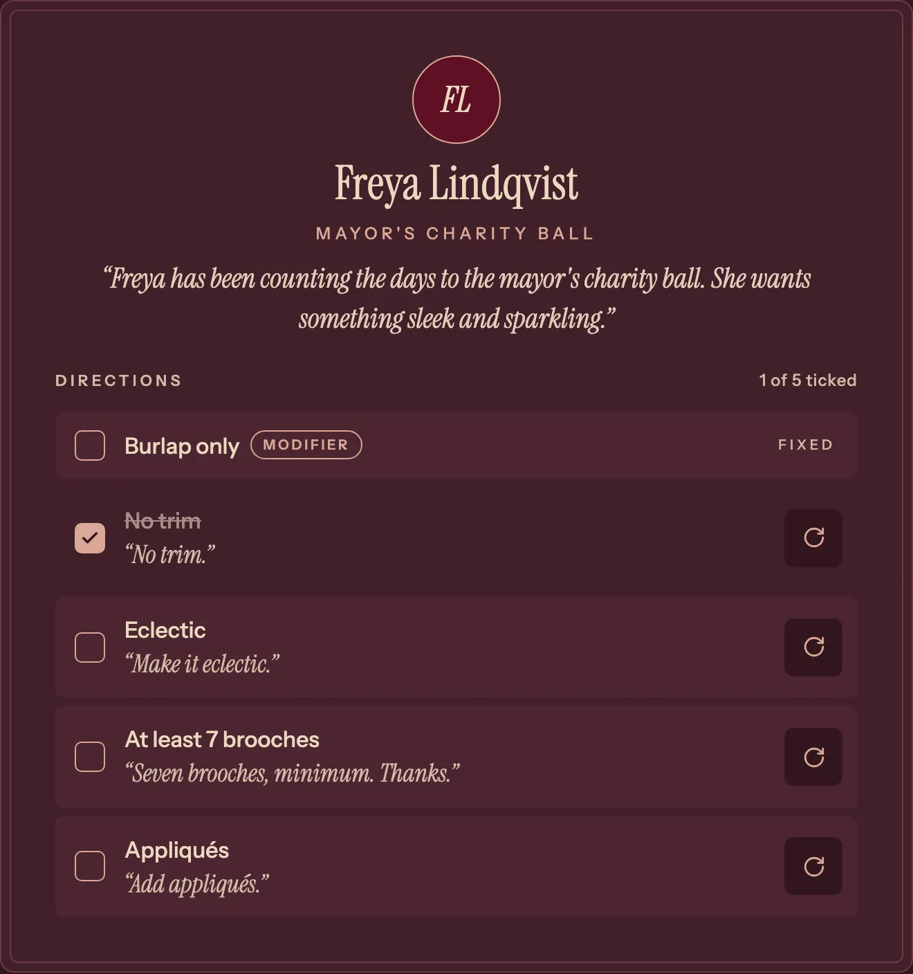
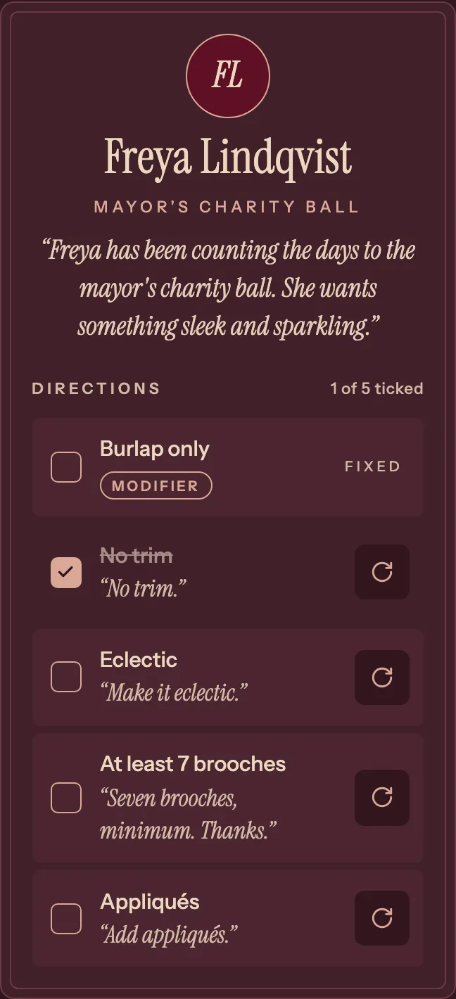
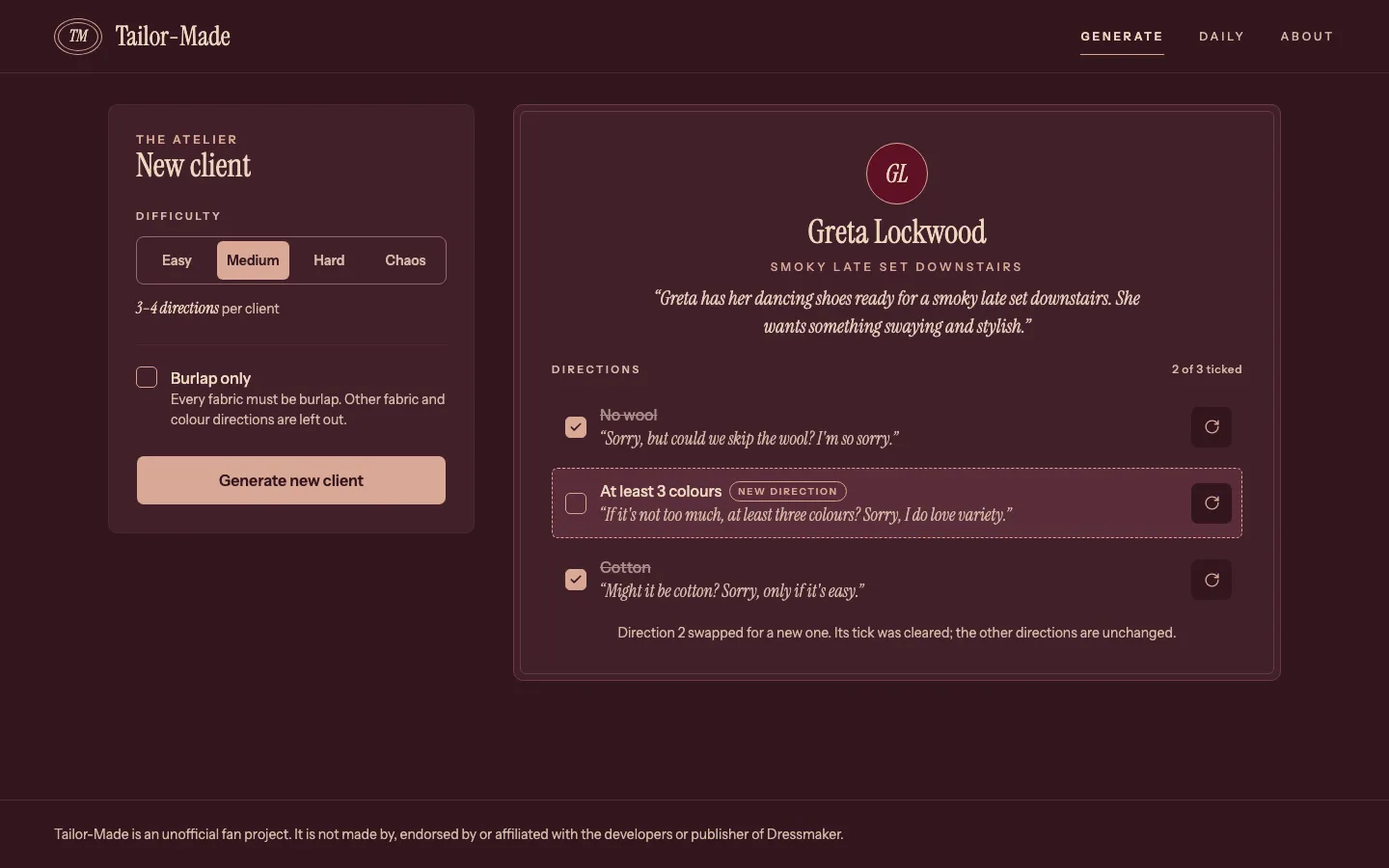
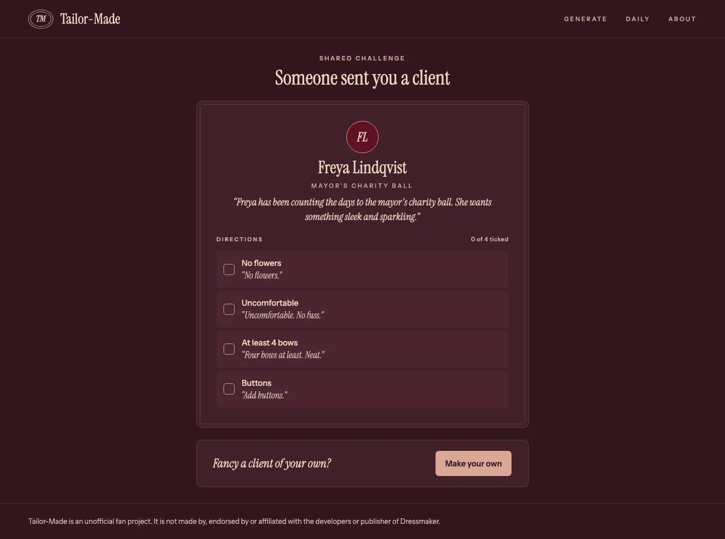
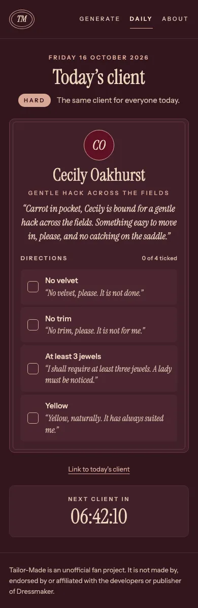
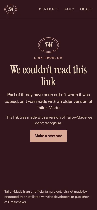
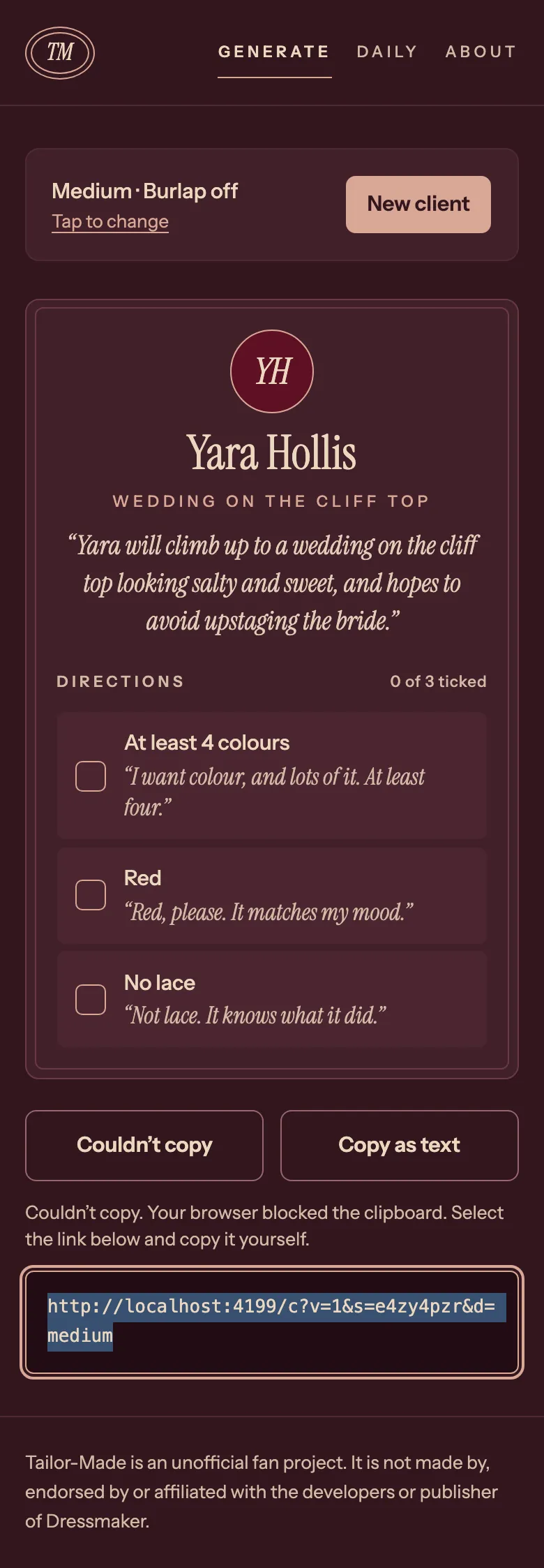
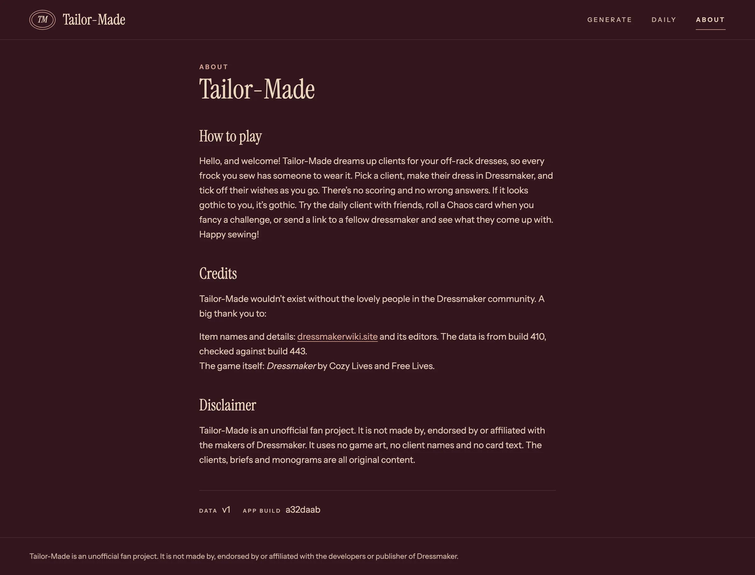
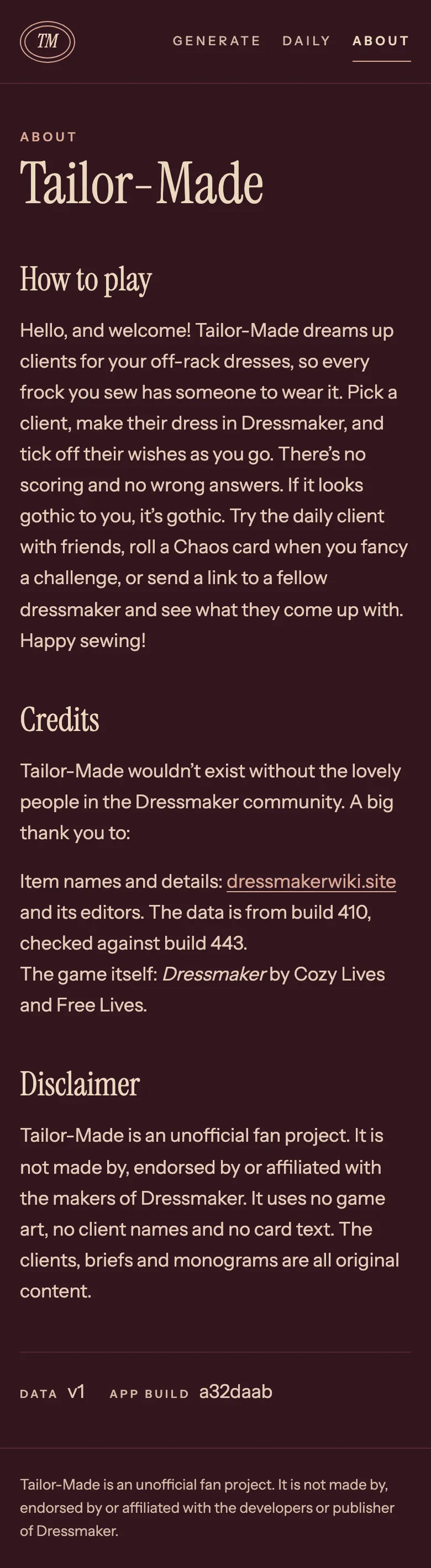
The generator, the client card, rerolls, share links, the daily challenge and the About page are built and live. These are real captures from the app, on desktop and on a phone.
What’s Next
The core game is done. Anything from here is a stretch goal.
- Tuning. Play about five challenges per difficulty in the game, then retune Chaos.
- Sharing. Add link preview images and post to the Dressmaker community.
- Extras. History and daily streaks kept in the browser, and a daily gallery of player screenshots.